Russian Constructivism was a design and architectural movement that started in Russia in 1914 which embodied half politics and half aesthetics. They favoured the machine as the source of universal progress having a social purpose rather than art for its art’s sake.
From a stylistic point of view constructivism was defined by flat and symbolic colours like red or grey and combinations of different sans serif type faces. Abstract was organised, using geometrical forms to create dynamic or visually stable forms. The process of getting the message across was photography and photomontage which was used as opposed to illustrations.
Figure 1. El Lissitzky Beat the Whites with the Red Wedge 1919
The idea of Constructivism was to demonstrate how the materials behaved- question the difference between wood, glass and metal which would dictate the form an artwork would take. For some this meant the translation of ideas and design into mass production, for others meant a new modern style expressing the dynamism of modern life.
The investigation of material, volume, and construction made it possible for us in 1918, in an artistic form, to begin to combine materials like iron and glass, the materials of modern Classicism, comparable in their severity with the marble of antiquity. In this way, an opportunity emerges of uniting purely artistic forms with utilitarian intentions…The result of this are models which stimulates us to inventions in our work of creating a new world, and which call upon the producers to exercise controls over the forms encountered in our everyday life.
(Constructivism – Concepts & Styles, n.d.)
The main artists of this movement were: El Lissitzky, Aleksander Rodchenko, Varvara Stepanova, Gustav Klutsis, Valentina Kulagina and Stenberg Brothers.
El Lissitzky made a career using art for social change. All his abstract work had a political message behind. Though his style was made from rudimentary shapes and colours, he made a strong impression on ideas like communality and egalitarianism. He used primary colours, black and white text and basic forms to tell stories, including traditional Jewish tales.
“The artist constructs a new symbol with his brush. This symbol is not a recognisable form of anything which is already finished, already made, already existing in the world – it is a symbol of a new world, which is being built upon and which exists by way of people.”
El Lissitzky
(Constructivism – Concepts & Styles, n.d.)
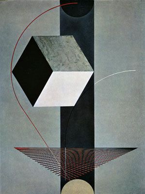
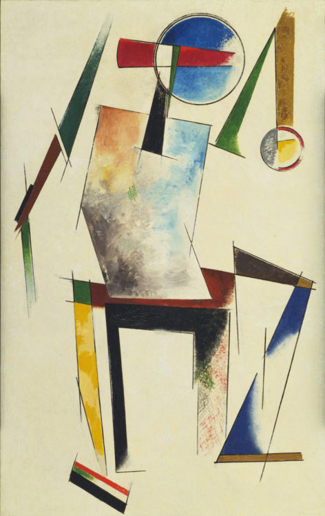
Figure 2. Proun 99 1925
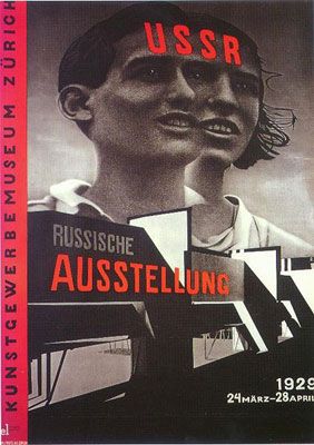
Figure 3. USSR, Russische Ausstellung 1929
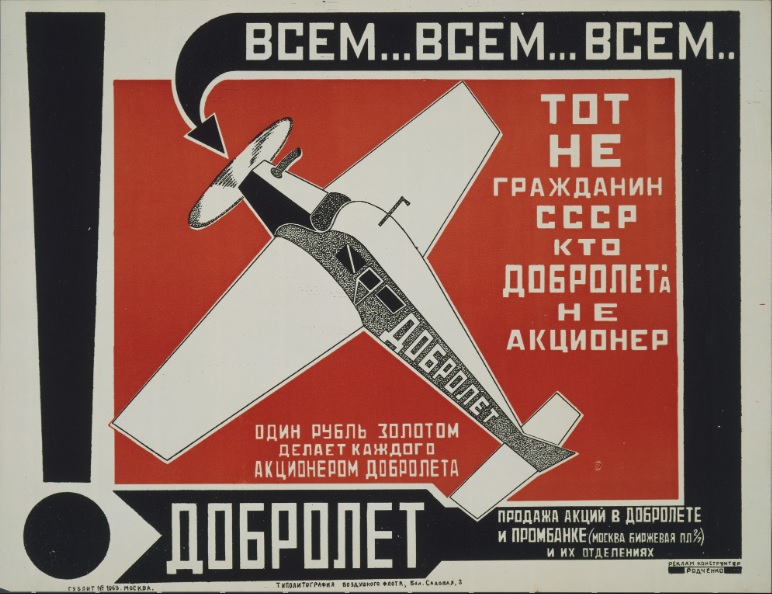
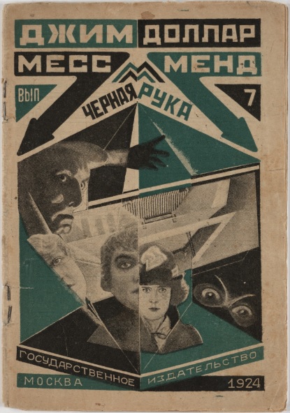
Aleksander Rodchenko is one of the most important avant-garde artist who used his art in the service of political revolution. His life-work was a never-ending experiment from painting and sculpture to graphic design and photography. His work included book covers, magazines, posters, photo-montage and illustration, set and costumed design for Russian theatres and even aircraft hangar. His influence spread across the early 20th century being impossible to narrow down the vast reaches of the ideology that he helped.
Figure 4. Dobrolet (Poster for a Russian state airline) 1923
Figure 5. “A Yankee in Petrograd” Vol. 7 Black Hand by Jim Dollar (Marietta Saginyan) 1924
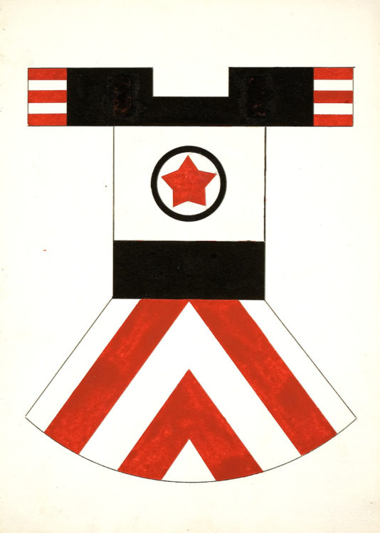
Varvara Stepanova believed that real artwork was made in the streets, factories and laboratories. In 1921 she co-founded the Constructivist Group which explored the artist’s efforts to design functional yet beautiful products for everyday life. She produced photo-montage, book covers, posters and theatrical sets before choosing designing fashion as her vision to express further. Her clothes designs were defined by dynamic shapes with sharp angular forms, printed abstract patterns and contrasting colours: bold reds and blacks. She dedicated her working life to create change within the society and influenced all modern day graphic designers to raise the standard.
Figure 6. Figure, 1921
Figure 7. Projet de tenue sportive féminine, 1923
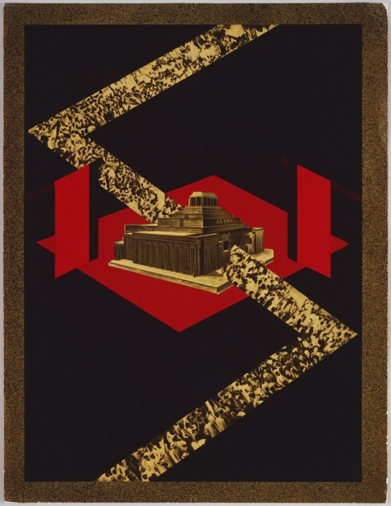
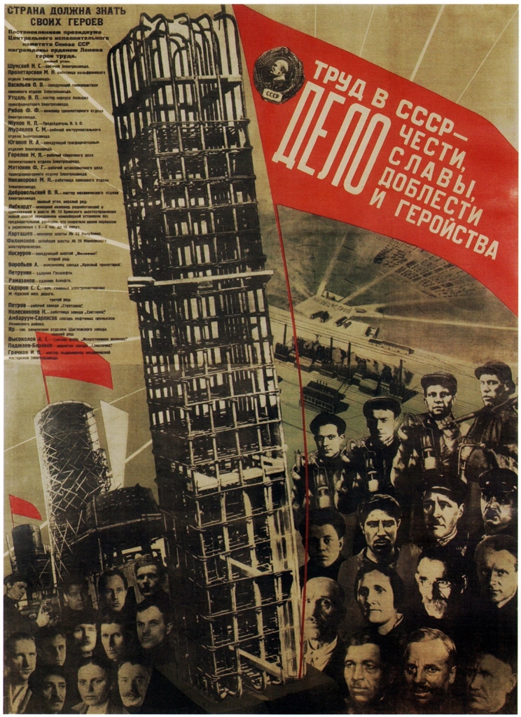
Gustav Klutsis was one of the pioneers of photo montage. He designed political posters, book covers, newspapers and magazine illustrations. He was an art teacher, photographer and graphic designer. He developed his own individual method of combining slogans and functional structures.
Figure 8. Memories of a dead ruler 1928
Figure 9. Work is a matter of honour 1931
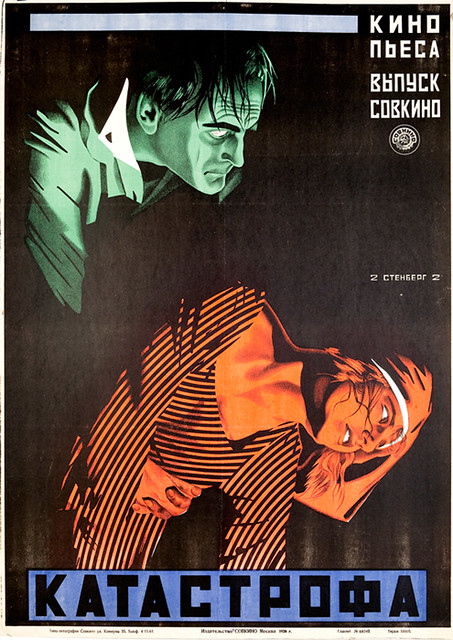
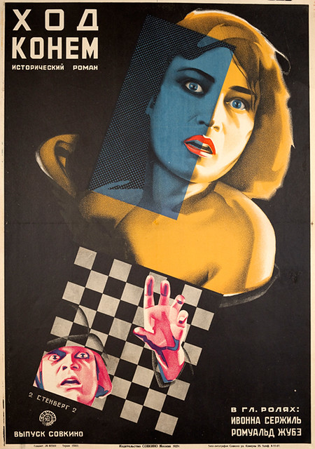
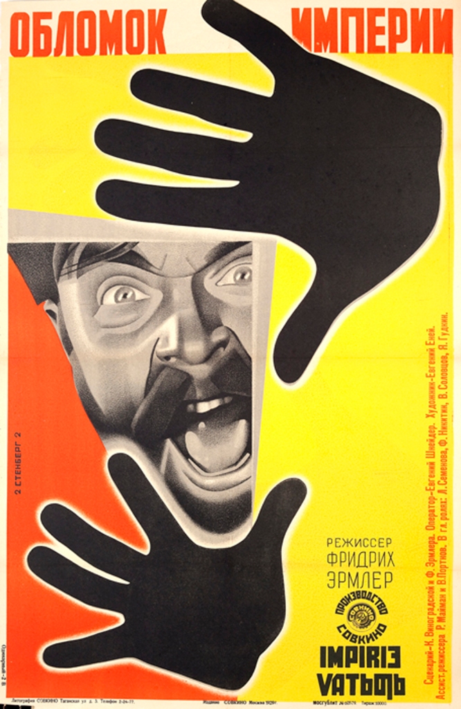
Stenberg Brothers created some of the most visually cinematic graphics in 1920. Their use of acid colours, fractured planes and distorted perspectives made some complex and captivating designs. From a stylistic point of view they assembled images into new collages. What made their work remarkable were their dynamic and innovative layouts accomplished by the use of montage. They used a projection machine which blow-up or distort the images for effect. This allowed them to create hand-drawn at a large scale of film stills that retained the appearance of photo montage.
Figure 10. Catastrophe 1926
Figure 11. A Shrewd Move 1927
Fiugre 12. A Fragment of an Empire 1929
Contemporary Influence
The movement flourished in Europe and became an inspiration to Western artists and designers.
“Rodchenko’s mentor, Wassily Kandinsky, taught at the Bauhaus art and design school in Germany after leaving Moscow in 1922, as did the Hungarian Constructivist Laszlo Moholy-Nagy. Their ideas were then disseminated by fellow Bauhaüslers when they fled from Nazi Germany in the 1930s to teach at Yale, Harvard, Black Mountain and other American schools.”
(Rawsthorn, 2009)
The legacy that left behind was the style being reinvented with the famous posters from Saul Bass for “Vertigo” and “Psycho” in 1950 and other movies from Alfred Hitchcock. But the movement was even more influential than that. You can see echoes
“for mixing media in the work of European designers, such as M/M (Paris) and Martino Gamper” or you can see it in the creation of digital imagery.” The “viz” phenomenon owes more to Soviet Constructivism than its academic pedigree. When Rodchenko and Popova designed posters and pamphlets for the Soviet state, they were trying to help a confused and largely illiterate population to make sense of the dramatic changes in their daily lives. New laws. New institutions. New working practices. New expectations. New taboos. Their striking collages must have looked as exhilarating to 1920s workers as luscious digital visualizations do to us today, and shared the same aim of helping people to make sense of the complexity of modern life.”
(Rawsthorne, 2009)
Looking at the poster that Matthieu Bourel designed for the article called “Is It Time to Call Trump Mentally Ill?” in 2017 I see a lot of similar characteristics to Constructivism movement. There is photomontage present, very nice layered indicating I presume Trump’s state of mind at that moment. There are two colours present: grey and orange. In Constructivism red was the colour that was representative but here orange is used to draw attention. The theme is political which defines the movement. There is no type but I believe the message is very straightforward. Everything is clean and organised even though there is no dynamic. The background is simple, drawing a line at the bottom and mixing the colours to draw the viewer’s attention to the 4 people staring at Trump looking as if they are trying to make a decision.
Figure 13
Matthieu Bourel is a french artist whose work is based on the power of images and the diversion of a wide range of visual combination.
He defines his work as ‘data-ism’, and when mixing elements, he often seeks to evoke a story that, although absent from the known reality, is powerfully present before the viewer and inspires ‘nostalgia for a period in time that never truly existed’.
(Matthieu Bourel: Collage and the power of images – The re:art, 2020)
Industrial revolution meant the transition from handcraft economy to one that was dominated by the machine manufacturing. This shift began in Britain in 18th century and spread across the world after. There were changes that affected 3 main features: technological, socio-economic and cultural. The invention of steam engine and steel had a major effect on society. A society that used to walk and used their rivers to ran factories now they had access to transport and to sources of energy. The invention of steel led to construction of cars and to buildings much taller.
In the mid18th century innovations like flying shuttle, the spinning jenny, the water frame and the power loom made the production of clothes much easier.
A new method of producing glass brought the famous structure called the Crystal Palace. The cylinder process used to create sheet of glass was first used by the Chance Brothers. The same method was used for the Crystal Palace which was designed by Joseph Paxton to house the Great Exhibition of 1851. The process lasted 9 months from start to finish, For many years, the Crystal Palace hosted shows, exhibitions, concerts and matches until December 1936 when it was destroyed by fire.
Figure 1
One of the negative effects that the industrial revolution had was pollution. Living conditions were very hard during that period with children dying before 25 from lung cancer and many other people from chest disease, cholera, typhoid or smallpox due to poor hygiene and cramped houses.
Figure 2
For printing and graphic design there was a great impact as well. Because of the technology that was applied there was a huge increase in printed material which led to typographic communication, books and posters. In the beginning the style was defined by inflexible grid layout and there were limited typeface options. Later another practice appeared called colour lithography which is used to engrave plates and chemicals to create an image. This process led to new opportunities for creative advertising and design. The use of lithography allowed typography to be more organic. The effects produced by charcoal and black chalk were dramatic. It was embraced by many artists and illustrators and proved to be an important graphic invention for many in that period.
There are few typographers who were well known in that period: Joseph Jackson, Thomas Cotterell, Vincent Figgins and William Caslon. Cotterell and Joseph were known for the fat face type. Bold style with its weight and contrast increased. Vincet Figgins was known for his slab-serif style and three-dimensional fonts. In 19th century he also presented Tuscan-style letters which was defined by serifs that were extended and curved. Caslon designed a san serif type which was legible, graceful and classic and it bears his name. It was a perfect choice for printed communication pieces. He left an important legacy behind which inspired other typographers like Baskerville and he changed the way text was communicating during the industrial revolution.
There were other techniques that developed during this period which let to changes and new job opportunities like: wood type, display type, steam- power printing press and Linotype. Linotype led to a huge demand on books and production of periodicals which reached to millions of people by the end of century.
This dynamic, exuberant, and often chaotic century witnessed an astonishing parade of new technologies, imaginative forms, and new functions for graphic design.”
Victorian era corresponded with the period of Queen Victoria’s reign and was defined by a class-based society who was able to vote and had a growing economy. At that moment Britain was considered the most powerful empire in the world. It was a period of strong morals and religious beliefs and the design was defined by heavy ornaments and decorative style. Extravagant was present in architecture, clothes and furniture and nostalgia and idealised beauty were expressed through printed images of young women, children and flowers.
Figure 1. William Powell Frith, Many Happy Returns of the Day, 1856, oil on canvas, The Mercer Art Gallery, Harrogate, London.
Victorian graphic design can be described as nostalgic, romantic, cluttered and decorative. Symmetry was also used heavily in layout and design. The production medium used for this famous Victorian designs was called chromolithography which led to colourful printed images. The designs were very illustrative and decorative at this point with complex montage. The designs did not reflect a philosophy but rather was a celebration of the evolving technologies.
Figure 2. Antique Lithograph 1880s Victorian Parlor Print Girl Reading a Book – Avid Vintage
Figure 3. c 1880 McLoughlin Bros The Story of Cock Robin with Color Plates Chromolithograph Illustrations Victorian Children’s Book Familiar Series
The main figures that represent this style were: Walter Crane, Randolph Candelcott, Kate Greenaway, James and John Harper and Charles Dana Gibson.
Walter Crane was known for one of the earliest influential designer of children’s picture books. The books were inspired by Japanese woodblock print, with flat, decorative perspective. He viewed each book as a work of itself where every design element was reflective of the whole. He played an important role in Art and Craft movement and he was recognised for his art and design education.
Crane’s work featured some of the more colourful and detailed beginnings of the child-in-the-garden motifs that would characterise many nursery rhymes and children’s stories for decades to come.
(Walter Crane 1845–1915 | Tate, n.d.)
Figure 4. Walter Crane – Illustrations from Flora’s Feast: A Masque of Flowers 1889
Figure 5. Walter Crane. Beauty and the Beast. 1901. Wood engraving.
Randolph Caldecott started his career as a banker yet he had from early age this hobby to draw and sketch the buildings and landscapes that surrounded him. His first drawing was published in the Illustrated London News in 1861. After more publications displayed his work, he decided to move to London and make a career as an artist. He was known for the children’s picture books because of his humorous drawings and the way he fused art with language. He was also known for the ability to exaggerate movement and facial expression on people, animals and even objects around that were personified.
Randolph Caldecott may have had a brief life, but his work sets him among Kate Greenaway and Walter Crane as the best children’s illustrators of his time. By remembering his work and art, we make sure children will be introduced to the magic of books for generations to come.
(Reimann, n.d.)
Figure 6. The complete collection of pictures & songs, “This is the House that Jack Built” 1887
Figure 7
Kate Greenaway was born in London on 17 March 1846. She studied graphic design and arts and embarked on a career of designing greeting cards. She was known for the pictures of girls dressed up in old fashion manner. The clothes she designed had a major influence on children’s fashion design.
Figure 8
Fiugre 9. Blue shoes, from Marigold Garden 1892
James and John Harper launched a small printed firm in 1790 in small factory in Walsall Road. The firm was known to be one of the first to introduce and develop machinery and resulted into production of all kind of products. They also were the first to introduce pictorial magazine in 1850, having monthly magazine founded for women and youth audience and a weekly periodical that functioned as newsmagazine.
Figure 10
Figure 11
The drawings of Charles Dana Gibson defined the period from 1890 to 1900 as being one of the most influential on the development of American beauty. He became an art editor of Harper and Brothers firm in 1863 and he raised the standard of pictorial images in the company.
Gibson’s name is still remembered for its association with the icon he created, the “Gibson Girl.” This idealised, refined upper-middle-class woman became so popular that she was featured in stage plays, and her image was printed on a variety of domestic objects.
(Webb, 2019)
Figure 12. Gibson Girl pen and ink on paper 31.7 x 24.2 cm
Figure 13. A Word to the Wise. Have a Book in Case you are Bored.
Typography was defined by highly ornate letter forms, variations on type size and weight and was influenced by Gothic and calligraphic approach.
Figure 14. Victorian Lettering from 1864, German Chromolithographer, Louis Prang & Co.
Figure 15. Victorian almanac for 1903 : and astronomical ephemeris containing all necessary information, reduced to the meridian and longitude of Melbourne./ ([Melbourne : Mason & Firth], 1903).
The origin of Arts and Crafts movement was in Britain in 1960 followed by Europe and North America around 1880-1920 and Japan in 1920 known as the Mingei movement. It had a powerful influence in Europe until Modernism appeared in 1930s.
The term was used for the first time almost twenty years later in 1887 by T. J. Cobden-Saderson and he was inspired by three people: an architect, a writer and a designer.
The style was characterised by floral and organic forms and was inspired by medieval, romantic and folk style decoration. It was represented by natural materials and disliked everything that was synthetic or modern.
In terms of chromatic and aesthetic of the interior design there were earthy colours present in this style. There were mid to dark tones used to create a pleasing interior colour palette. Vegetable colours were very popular along with greyish sage green and yellow undertone. The white on the walls was perceived different than it is now. In that period white meant pale grey, coffee with cream, beige or even a buff yellow.
Figure 2. Inside a Craftsman Foursquare, from Portland, Oregon 1911
The main artists of the movement were: William Morris, Kelmscott Press, Philipp Web and Charles Rennie Mackintosh.
William Morris was an important figure of international Arts and Craft Movement. He did something extraordinary with the artisan-ship and cottage industries of the Middle Ages. For him, the activity of creating something was very spiritually, a strong connection between the human beings and their natural environment.
“That think which I understand by real art is the expression by man of his pleasure in labour.
(Morris, n.d.)
He was the first artist to combine word and image in the expression of his vision. His focus was on design for textile, typography, books and wallpapers. He was inspired by nature and many of his works are defined by birds and flowers. His design embraces simplicity and dignity and is opposite to the Victorian style which was heavy and too decorative.
Figure 3. Yellow gold Acanthus 1874
Figure 4. Strawberry Thief Fabric
Kelmscott Press was keen to preserve the old relationship between the artist, his art and his society. He was set up in London in 1896 by Morris. He was interested in the printing and the binding of fine books and he was influenced by medieval manuscripts and the work of early printers such as Caxton. Though his books were expensive, they were liked and designed to be read slowly and to be appreciated.
Figure 5. The tale of King Florus and the Fair Jehane / [Translated by William Morris from the French of the 13th century.] Hammersmith : Kelmscott Press, 1893
Philip Webb was known for designed furniture, tapestries, wallpaper and stained glass. As an architect Philip is known by the comfortable, traditional style. His home designs shows traditional English building methods like red bricks, tall Tudor-like chimneys, sash windows or steep-sloped roofs. He was considered a pioneer figure in the English Domestic Revival. His works was also influenced by medieval styles and the gothic revival movement.
Figure 6. The Red House
Charles Rennie Mackintosh’s work was once described by a close friend:
“ the creations of Mackintosh breathe”
(Mackintosh, n.d.)
He was able to give life to the ordinary. His design expressed serenity, spirituality and attention to detail. His style was combined with the minimalism of Japonism and the love for floral motifs. He transformed the Glasgow School of Art and put Scotland on the map as a centre of creativity and a hub for art and design.
The movement started between 1890-1910 in Europa and United States. Art Nouveau was defined by its organic line and was most identified in architecture, interior design, jewellery, glass design, posters and illustrations. Nature was the main inspiration and curvilinear forms were the dominant theme. The main idea was to create a whole new style. Art Nouveau came as a reaction against the Victorian movement and historical imitations. This period was very important because modern architecture, graphic and industrial design, surrealism and abstract art have roots in art nouveau’s concepts. The style was defined by the following characteristics: decorative pattern like tendril motifs, lavish birds, flowers and insects and curvaceous bodies of beautiful women.
Figure 1. Emile Hurtré; Design for a Wall Decoration with Peacock, Cranes, and Sunflowers for the Restaurant in Hotel Langham (Paris)
In England the precursors were the illustrator Aubrey Beardsley and William Morris from the Art and Craft Movement, who emphasised the vital style in the applied arts. In Europe, Art Nouveau was inspired by the painters Paul Gauguin and Henri de Tolouse-Lautrec. The main artists of the movement were: Eugene Grasset, Theophile Alexandre Steinlen, Aubrey Beardsley, Henri de Tolouse-Lautrec and Alphonse Mucha.
Aubrey Beardsley was known as a great illustrator from a young age. His was work was controversial and was described as elegant, decadent and erotic. He was the art editor of Yellow Book and produces many covers and illustrations. His whole conception of the illustration was profound and very original. He died very young and his work inspired many artists like Harry Clarke, Wassily Kadinsky and Pablo Picasso.
Figure 2. Enter Herodias 1893
Figure 3
Henri de Tolouse-Lautrec started painting from a young age innovating the lithograph drawing. He was known from his posters inspired by Japanese style and impressionism Edgar Degas. He captured the night life of la belle epoque “the beautiful era”. His most famous work was The Englishman at the Moulin Rouge and the paintings at the Moulin Rouge. He was known for his realistic depictions of women. Cora Michael, curator of drawing and prints at the Metropolitan Museum of Art said
“Lautrec presents her neither as a moralising symbol nor a romantic heroine, but rather as a flesh-and-blood woman . . . as capable of joy or sadness as anyone.”
He left behind a rich legacy of more than 700 canvas paintings, 350 prints and posters and 5000 drawings.
Figure 4. The Englishman at the Moulin Rouge 1892
Figure 5. At the Moulin Rouge, The Dance 1890
Theophile Alexandre Steinlen was born in Switzerland and moved to Paris at the age of 21. He had strong political views and he tried to express this through his illustrations and printmaking. He viewed his work as a tool resistance against oppression. One of his famous work is Le Chat Noir poster for a café. Cats were an important subject to him. At that time the symbolisation of the cat represented the bohemian women. His main concern was with the working class and marginalised populations. His focus remained the same in many ways on women, children, orphans and those killed in battles.
Figure 6. Le Chat Noir 1890
Figure 7. The Exodus (L’exode) 1915
Alphonse Mucha was a Czech illustrator and painter. He is known for his Art Nouveau posters of plays in Paris with Sarah Bernhardt. He also created the 20 monumental painting known as “Slavic Epic” showing the history of Slavic people. His style was to surround women in lavish flowers and other organic forms. He was a central figure in the Art Nouveau style.
Figure 8. THE PRECIOUS STONES: TOPAZ
Figure 9. Slavic Epic
Eugene Grasset was a Swiss artist known for his decorative artworks. His style was defined by ornamental elements like flowers, trees full of curvy and circular motifs. We worked with painting, sculpture, design, furniture, jewellery making and graphic art. He is considered the father of Art Nouveau. Two main characteristics of Grasset work were: precision and thoughtfulness. He was well known for his posters. The most famous work is: The Sun of Austerlitz and The Wooly Horse. They were done for the Century Magazine to promote the life of Napoleon Bonaparte. He preferred traditional methods and used classic techniques.
Some of his posters illustrated the alternative nightlife of Paris, where he would portray men and women drinking and enjoying the lustfulness of the city life. That was one of the reasons he was considered a rebel, giving that he would teach at the academies, designed glass doors and windows for aristocratic homes, and enjoyed spending time in Paris artistic social circles.
To understand the movement better we have to take a look at the social, political and cultural context. The need of Art and Craft movement appeared as a critique of the industrial society. There was a great loss of traditional craft methods. William Morris advocated for a society of free craftspeople as he believed that existed during the Middle Ages. He believed that craftsmen loved creating and the process of their work. In Britain the movement was associated with other reforms movement like dress reform, the garden city movement and the folk-song revival. All of them had in common the ideal of “the simple life”. In Europe the movement meant preserving the national traditions.
In terms of interior design and choosing the colours, context is very important. In this period, the rooms were no longer dark. The appearance of light changed the colours that were used before. The Arts and Craft palette was called autumn palette because its warm tones naturally go with all the wood trim and furniture of that period. The reason they did not paint the walls white as we are familiar now is because of the dark furniture. The darker the wood, the more was avoided because of its high contrast. Vegetable colours were very popular along with greyish sage green and yellow undertone. The white on the walls was perceived different than it is now. In that period white meant pale grey, coffee with cream, beige or even a buff yellow.
Figure 1
Figure 2
Figure 3
Figure 4
I am absolutely in love seeing what Ben Penetreath did in regard of this style. He combined a strong use of colour, pattern, and classical details with bold contemporary fabric and furniture. The result is refreshing and you can feel the connection straight away with the nature due to the use of earthy colours in combination with blue or red. There is also marble present along with the wallpaper inspired by William Morris which gives an elegant touch. Wood is still present but not so much as it used to be, letting the room breathe more.For example we can see that in the living room. There are some colours and patterns on the floor which clearly were inspired from that period but it is also more bright and open due to the contrast with the white from the walls.


