Uncategorized

From Pop Culture to Digital

Right after war, there was a strong, overwhelming creative boom in 1950 coming from the youth culture. Mass production was everywhere and it was the right time for pop culture to make its way into art.

The start became with Beat movement in 1950 then followed by the Hippie culture in 1960 along with Punk and New Wave in 1970 and 1980. Later was followed by Grunge and Hip Hop in 1990.

“This youth led culture impacted significantly on graphic design and helped spawn a new generation of progressive fresh design styles to capture the zeitgeist of day.”

(I. Gorman 2019, moodle)

Pop art was characterised by consumerism and had a strong reaction against the norms of society. Its purpose was to reflect everyday life and common objects. The movement was criticised because it was art for the masses inspired by the ideas of fame and mass production.

The movement was defined by the following characteristics: 

  • bright colours;
  • recognisable images;
  • humour;
  • innovative techniques like lithography or printing from a metal plate or stone;
  • the use of different types of media.

“Pop art is: Popular (designed for a mass audience), Transient (short-term solution), Expendable (easily forgotten), Low cost, Mass produced, Young (aimed at youth), Witty, Sexy, Gimmicky, Glamorous, Big business.”

Hamilton describing the movement’s characteristics.

(n.d.)
Figure 1

Key Figures

Peter Blake is an important figure in Pop Art movement known for his album covers which are colourful, bold and optimistic using ground-breaking methods like screen printing. He blended the new popular culture and pop music scene in London with art references from the past which helped creating a form of urban realism. He broke down barriers between traditional art and new field of Pop.

 “You simply can’t make art without having that history of art behind you and I think if you asked any artist they would always say they had learned from previous art. Perhaps I show that more than most in that I often appropriate art and quote from it.”

(Blake, n.d.)

Richard Hamilton was a British painter and a collage artist. He was the one to introduce the idea of the artists as an active consumer and contributor to mass culture. Before him there was the approach that art should be separated from commerce. For him, the movement was a way of life. He succeeded in filling the gap between high art and consumer culture by immersing in movies, television, magazines and music. He paved the way for other artists like Andy Warhol, Studio 54 and the Velvet Underground.

Andy Warhol was an American painter, filmmaker and print maker. His ambition was to bring popular styles to exclusive salons of high art. His drawings were comic, decorative and their tone was opposed to the cold mood of his Pop art. During 1960 he started to make paintings of famous American products as well as paintings with celebrities.

Roy Lichtenstein was an American Pop artist. His work included variety of style and displayed knowledge of modernist painting. He developed his pop style in 1961. He selected comic strips as a topic which was influenced by popular advertising and comic book style.

PSYCHEDELIC DESIGN (1960-1970)

The social climate for this movement was about being free of the constraints of 1950 period. The hippie movement developed a new organic style that was traced back to the Art Nouveau period. The style’s approach was in opposition to Swiss Style which was seen rigid favouring the style.

The elements that define the style are the following:

  • Hallucinations, distortion of perception and awarness;
  • Abstract swirls, intense colours, curvilinear calligraphy;
  • the use of colours of the opposite end of colour wheel to create a trippy effect.
Figure 12 Left Victor Mosoco/ Right Wes Wilson

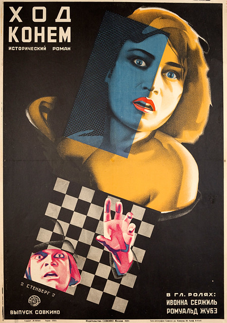
Punk and New Wave (1970-1980)

Wolfgang Weingart was the one to introduce the New Wave movement which went further through his studies. He felt the need of change focusing on the way typography looked, approaching the chaotic collage inspired by Dada. He was breaking the rules with the strict grid using a more intuitive approach regarding of the placement.

Figure 13

Key Figures

  • Peter Saville
  • Jamie Reid
  • Paula Scher

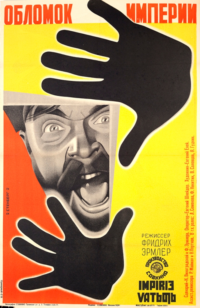
Punk movement was a reaction to the rules of Modernism and came from a society that decided that there was a change needed. This changed was articulated by album covers like Sex’s Pistols which was designed by Jamie Reid who was influenced by Dada movement where type was treated like a photograph.  He used strong colours and cut-up aesthetics to underline the feelings of rebellion.  Paula Scher uses as well strong colours and she is influenced by Bauhaus and Swiss style to design a dynamic poster which catches your eyes immediately.

Digital Design

The changes of graphic design shifting towards computer generated design would not have been possible without the development of 1980 and 1990. Among the designers who embraced the style and left a legacy behind are:

  • Susan Kare;
  • April Greiman;
  • Neville Brody.

The early innovators paved the way for what we know today as contemporary design which led to another shifting into the visual communication of today. The artists that followed this path are:

  • Louise Fili
  • Michael Beirut
  • Stefan Sagmeister
  • Jonathan Barnbrook

Contemporary Comparison

There is no doubt that the youth creators of psychedelic graphics transformed the visual communication in 1960. I believe that the legacy that was left behind was to approach art on experiential, intuitive level. They focused on creating a relationship between the graphic image and the experience of the viewer perceiving it. The influence is still present today both in art and music for artists who want to achieve a deeper connection and explore their imagination further.

Mario Martinez’s paintings are known for their colourful geometric shapes, shaped patterns and unique textures. All together brings quasi-extraterrestrial landscapes alive challenging you to see a perspective that you never thought about before.

Sources:

Blake, P., n.d. Peter Blake Paintings, Bio, Ideas. [online] The Art Story. <https://www.theartstory.org/artist/blake-peter/#nav>;

Danielgalea93.blogspot.com. 2015. New Wave Design. <http://danielgalea93.blogspot.com/2015/01/new-wave-design.html>;

Hamilton, R., n.d. Richard Hamilton Paintings, Bio, Ideas. The Art Story. <https://www.theartstory.org/artist/hamilton-richard/>;

Isobel Gorman, 2019, Design History: Pop Art, Psychedilia and Digital Design, Dublin: Dublin Institute of Design;

Lichtenstein, R., n.d. Roy Lichtenstein Paintings, Bio, Ideas. The Art Story. Available at: <https://www.theartstory.org/artist/lichtenstein-roy/>;

Medium. n.d. How Punk Changed Graphic Design And Is History Repeating Itself?.<https://medium.com/@SHyndman/how-punk-changed-graphic-design-ad40cb685180>;

n.d. [online] Available at: <https://www.invaluable.com/blog/what-is-pop-art/>;

Sarajacobsendesign.no. n.d. Design History. [online] Available at: <http://sarajacobsendesign.no/New_wave.html>;

The Art Story. n.d. Andy Warhol Paintings, Prints+, Bio, Ideas. <https://www.theartstory.org/artist/warhol-andy/#nav>;

Widewalls. n.d. Mario Martinez – Quasi-Extraterrestrial Landscapes. [online] Available at: <https://www.widewalls.ch/psychedelic-artists-top-list/mario-martinez/>;

Widewalls. 2016. A Short Guide Through The History Of Pop Art And Design. <https://www.widewalls.ch/pop-art-design/>.

Images:

Figure 1. Widewalls. 2016. A Short Guide Through The History Of Pop Art And Design. <https://www.widewalls.ch/pop-art-design/>;

Figure 2. https://ro.pinterest.com/pin/607634174700580125/;

Figure 3. https://ro.pinterest.com/pin/607634174700580149/;

Figure 4. http://www.artnet.com/artists/richard-hamilton/fashion-plate-a-qZxyMrZ4IbdVklIhV6cjGQ2;

Figure 5. http://www.artnet.com/artists/richard-hamilton/flower-pieceaaa-TcsgkVirneeuHC99PvFMBA2;

Figure 6. https://www.wikiart.org/en/andy-warhol/campbell-s-soup-can-onion;

Figure 7. https://www.wikiart.org/en/andy-warhol/coca-cola;

Figure 8. https://www.wikiart.org/en/andy-warhol/liz-taylor-1;

Figure 9. https://www.wikiart.org/en/andy-warhol/marilyn-1;

Figure 10. https://www.wikiart.org/en/roy-lichtenstein/drowning-girl-1963;

Figure 11. https://www.wikiart.org/en/roy-lichtenstein/in-the-car-1963;

Figure 12: Widewalls. n.d. Do You Know What Psychedelic Art Is?. <https://www.widewalls.ch/psychedelic-art/> ;

Figure 14. http://www.artnet.com/artists/jamie-reid/never-mind-shengshouにしやがれ-r5M53rf5PgUo8WjIn9rpaw2;

Figure 15. https://ro.pinterest.com/pin/358176976594535788/;

Figure 16. https://www.pinterest.co.uk/pin/57280226486071868/;

Figure 17. https://ro.pinterest.com/pin/105130972530084895/;

Figure 18. Widewalls. n.d. Mario Martinez – Quasi-Extraterrestrial Landscapes. <https://www.widewalls.ch/psychedelic-artists-top-list/mario-martinez/>;

Figure 19. Widewalls. n.d. Mario Martinez – Quasi-Extraterrestrial Landscapes. Available at: <https://www.widewalls.ch/psychedelic-artists-top-list/mario-martinez/>.

Design History

The Swiss Style

The Swiss style movement is known as International Typographic movement and was developed between 1950-1960.The start of this movement begun in Germany and Switzerland and was led by Joseph Muller-Brockman and Armin Hoffman.  During the Second World War many artists flew to Switzerland because it was neutral. Many talented designers settled there working to develop their studies.

The Swiss style focused more on photography rather than illustrations. Joseph and Armin taught at two schools Zurich School of Art and Krafts and Basel School of Design which were responsible for the great Swiss Style influence on designers.

The Swiss Style is characterised by sans serif type, asymmetrical layouts, underlying grid and structure, geometric forms, absence of decoration and illustration and photography. The reason behind these ideas was that the design needed to be clear and legible for the viewer.

Figure 1

Key Figures

Max Bill was known as architect, painter, artist, industrial designer, typeface designer and graphic designer. He studied at Bauhaus between 1927 and 1929 and in 1931 he moved to Zurich.

He made his name as an artist and sculptor in the 1930s with his abstract geometric creations and swiftly became a focal point in the Swiss art scene.

(Max Bill – Swiss Artist (1908-1994) – i Design, 2015)

Bill’s aim was translating abstract ideas into concrete objects. His wok was versatile and was dominated by painting starting with landscapes and portraits and ending with developing his own style using geometric abstraction.

M. Bill is one of the most important exponents of this art genre.As spiritual father and architect of the Ulm “Hochschule für Gestaltung”, and as principal and head of the department for architecture and product form from 1952, Bill tried to continue the traditions of the Dessau Bauhaus.

(Max Bill – Swiss Artist (1908-1994) – i Design, 2015)

Emil Ruder was born in Switzerland and was known as a typographer and graphic designer. His approach to typography was to communicate ideas through writing. He emphasises the importance of sans serif type and his work is straight forward and concise. His style and use of grids inspired many designers.

Armin Hofmann was born in 1920 in Switzerland. He went to School of Arts and Craft and his girst job was a as lithographer in Basel and Bern. In 1925 he wrote the Graphic Design Manual which is still used as a reference today.

Hofmann’s work is marked as being primarily based on the fundamental elements of graphic form; point, shape and line. Despite its reliance on rudimentary elements it fluently conveyed simplicity, abstraction and complexity simultaneously. The posters he designed are considered his seminal work which accentuated the economical use of font and color.

(Armin Hofmann | Biography, Designs and Facts, n.d.)

Josef Muller Brockmann was born in Switzerland and by the age of 43 he became a teacher at the Zurich school of art and crafts. His work is influenced by different design and art movements like Constuctivism, De Stijl, Suprematism and Bauhaus.

He is perhaps the most well-known Swiss designer and his name is probably the most easily recognised when talking about the period.

(Flask, n.d.)

His work is still relatable and vital as it was in his period, the message being communicated straightforward and clear.

Herbet Matter was a Swiss American graphic designer who was known for using photo montage in commercial art. His worked involved different techniques like manipulating negatives or cropping and retouching images in unusual ways.

Max Huber was a Swiss graphic designer, artist and educator. He experimented with coloured geometric shapes and typography elements making his work dynamic and very distinct. He always used strong grids to maintain clear and rational construction.

Figure 20

Wolfgard Weingart became a graphic designer and typographer. His work is characterised as Swiss Style and he is the pioneer of the Swiss Punk Typography. His design process involved deconstruction, extrapolation, juxtaposition and cross-analysation.

Weingart played, experimented and continuously asked: “How many different ways can I see this same old stuff?”

(Wolfgang Weingart #tbt — Shillington Design Blog, 2015)

The approach he made changed the way the world receives information through visual communication.

Swiss Style Typography

Swiss Typography included the following typefaces:

  • Akzidenz Gortesk;
  • Futura;
  • Helvetica;
  • Frutiger;
  • Univers.

International Style and Corporate Identity

With the war ended, Swiss Style would meet the growth of America Corporate and escape the traditional boundaries of the style. Paul Rand and Saul Bass would be inspired by the movement and shift through a new era of visual communication.

Figure 22
Figure 23

The legacy left by Swiss style will not go away very soon because of its grid-based layouts, clean typography, and typefaces that are still used widely today. All of this are used for contemporary web design.

Contemporary Comparison

We can see the influence of Swiss style up until today. The left poster called Red,White and Blue was a tribute to the french flag and piano that was present at a music free event in France. It was designed by Empatia in 2014 and it was influenced by Swiss Style through the grid system that organise the information, use of geometric shapes and white space and the use of sans serif type. The approach reminds me of the work of Josef Muller Brockmann, especially the music posters.

Sources:

Encyclopedia Britannica. 2020. Herbert Matter | American Photographer. Available at: <https://www.britannica.com/biography/Herbert-Matter> ;

Famous Graphic Designers. n.d. Armin Hofmann | Biography, Designs And Facts. <https://www.famousgraphicdesigners.org/armin-hofmann> ;

Flask, D., n.d. Joseph Müller-Brockmann : Design Is History. Designishistory.com. <http://www.designishistory.com/1940/joseph-mueller-brockmann/>;

Flask, D., n.d. Emil Ruder : Design Is History. Designishistory.com. <http://www.designishistory.com/1940/emil-ruder/>;

History of Art. 2016. Swiss Design/International Typographic Style.<https://sophietabonehistory.wordpress.com/2016/02/03/swiss-designinternational-typographic-style/> ;

Idesign.wiki. 2015. Max Bill – Swiss Artist (1908-1994) – I Design. <https://www.idesign.wiki/max-bill/> ;

Isobel Gorman, 2019, Design History: The New Typography, Swiss Style & The International Style, Dublin: Dublin Institute of Design;

Productions, P., n.d. Dynamic, Rational Style Characterizes Max Huber’S Designs. Petrolicious.: <https://petrolicious.com/articles/dynamic-rational-style-characterizes-max-huber-s-designs>;

Reigstad, K., n.d. Swiss Style & Your Blog. [online] The Daily Post. <https://wordpress.com/dailypost/2016/01/27/swiss-style-and-your-blog/>;

Shillington Design Blog. 2015. Wolfgang Weingart #Tbt — Shillington Design Blog. <https://www.shillingtoneducation.com/blog/wolfgang-weingart-tbt/>.

Pictures:

Figure 1. Graphic Design History. n.d. Swiss Style | 1950 – Late 1960 – Graphic Design History. [online] Available at: <http://graphicdesignhistory.akidesign.no/swiss-style-1950-late-1960/>;

Figure 2. http://www.artnet.com/artists/max-bill/untitled-mid-century-modern-geometric-abstraction-a-5976PG64WN-FvRn-VHeHxg2;

Figure 3. http://www.artnet.com/artists/max-bill/aus-portfolio-kinderstern-a-H6YVPP0adDyOAHw-nV_gbw2;

Figure 4. http://www.artnet.com/artists/max-bill/untitled-OE2e-gdmnoC–f23J_fi1A2;

Figure 5. http://www.artnet.com/artists/max-bill/pyramide-in-form-einer-achtelkugel-goGgEXDSJPFc7kR9U3hAng2;

Figure 6 and Figure 7. 80. 2009. Emil Ruder. Posters. Available at: <https://80magazine.wordpress.com/2009/07/22/emil-ruder-posters/>;

Figure 8. https://ro.pinterest.com/pin/423056958718996881/;

Figure 9. https://ro.pinterest.com/pin/423056958718996882/;

Figure 10. https://ro.pinterest.com/pin/423056958718996880/;

Figure 11. https://ro.pinterest.com/pin/423056958718996879/;

Figure 12. http://www.artnet.com/artists/josef-müller-brockmann/juni-festwochen-zürich-tonhalle-grosser-saal-T2BZ6uhlqR7FlVY3UC1W2A2;

Figure 13. http://www.artnet.com/artists/josef-müller-brockmann/set-of-3-posters-YSMmylLsws7qUfZDBoSTyw2;

Figure 14. http://www.artnet.com/artists/josef-müller-brockmann/cycliste-attention-0Bw5Cg7iczb3waSSLllaQg2;

Figure 15. http://www.artnet.com/artists/josef-müller-brockmann/cycliste-attention-0Bw5Cg7iczb3waSSLllaQg2;

Figure 16. http://www.artnet.com/artists/herbert-matter/engelberg-schweiz-WH9FExlU43bl0zeyNvisQw2;

Figure 17. http://www.artnet.com/artists/herbert-matter/engelberg-IX2QvSm9QBvalAb-77Njrw2;

Figure 18, 19 and 20. Productions, P., n.d. Dynamic, Rational Style Characterizes Max Huber’S Designs. [online] Petrolicious. <https://petrolicious.com/articles/dynamic-rational-style-characterizes-max-huber-s-designs>;

Figure 21. Shillington Design Blog. 2015. Wolfgang Weingart #Tbt — Shillington Design Blog. <https://www.shillingtoneducation.com/blog/wolfgang-weingart-tbt/>;

Figure 22. artlistr. n.d. Paul Rand – 6 Interesting Facts • Artlistr.<https://artlistr.com/paul-rand-6-interesting-facts/>;

Figure 23. https://www.indiewire.com/gallery/saul-bass-movie-poster-movies-vertigo/;

Figure 24. Hipsthetic. n.d. 11 Contemporary Projects Influenced By Swiss Style Design – Hipsthetic. [online] Available at: <https://www.hipsthetic.com/11-contemporary-projects-influenced-by-swiss-style-design/>;

Figure 25. Hipsthetic. n.d. 11 Contemporary Projects Influenced By Swiss Style Design – Hipsthetic. [online] Available at: <https://www.hipsthetic.com/11-contemporary-projects-influenced-by-swiss-style-design/>.

Presentation

The influence of Russian Avant-garde Film Posters

• This movement meant a new direction in art and its influences from technology, geometric shapes and photo montage will become a big part of the Soviet lifestyle.
• The context when this movement happened was after the Bolshevik Revolution of 1917. In this context ideas mattered, were very important even dangerous. The purpose of the ideas expressed through art started from something intangible to having the power to change society. In 1919 Lenin said

“Of all arts, for us cinema is the most important.”

(Gariff, D., n.d.)

• The start of the movies industry begun in 1920. The State Cinema Enterprise called Goskino opened in 1922 and was changed to Sovkino in 1926. The advertising department was called Reklam Film and the main roles were designing, approving and distributing film posters throughout the country. The advertising department was led by graphic design Yakov Ruklevsky.

• He recruited a lot of talented artists including the Stenberg Brothers, George and Vladimir, Nikolai Prusakov, Mikhail Dlugach and Alexander Naumov.

• The golden age of the Russian film poster was between 1924 and 1930. They were seen as an ideal tool to educate the illiterate masses.

• Two of the most dynamic posters artists were the Stenberg Brothers Vladimir and George. Their work was based around Constructivist principles having art as a practice for social purposes.

• This came to an end in 1930 because of Stalin who preferred art as propaganda rather the free expression to ideas. The work of filmmakers, writers and artists were censored. Anybody who refused to comply faced labour camp.

• The author Susan Pack says in her book Film Posters of the Russian Avant-garde,

“Stalin may have closed the window of creativity, but not before it had illuminated history with some of the most brilliant posters ever created.”

BBC Arts – To The Cinema, Comrades: The Revolutionary Age Of Soviet Film Posters

• The posters have in common the influence of Russian style in different periods. Photo montage and print screen is present, as exaggerated scale, sense of movement, a dynamic use of colours and sans serif types. All of them are based on a controversial issue which has an impact both socially and culturally.

It is easy to take for granted dynamic composition of film poster at this stage but I believe the Russian style posters had a great influence in cinema and what the Stenberg brothers did on that period of time was unprecedented to the film poster art and will remain an inspiration for the artists to come.

Sources:

BBC. 2017. BBC Arts – BBC Arts – To The Cinema, Comrades: The Revolutionary Age Of Soviet Film Posters. [online] Available at: https://www.bbc.co.uk/programmes/articles/4F3Tn4PT9rdt8nntNJc5Dp6/to-the-cinema-comrades-the-revolutionary-age-of-soviet-film-posters ;

Being in orbit. n.d. Russian Constructivism: From Avant-Garde To Propaganda. [online] Available at: https://beinginorbit.wordpress.com/essays/from-avant-garde-to-propaganda/ ;

Brody, R., 2018. “Isle Of Dogs” Is A Stylish Revolt Against (American) Political Madness. [online] The New Yorker. Available at: https://www.newyorker.com/culture/richard-brody/isle-of-dogs-is-a-stylish-revolt-against-american-political-madness;

D’Souza, S., n.d. Soviet Film Posters Of The 1920S Exhibition | Just A Platform. [online] Justaplatform.com. Available at: https://www.justaplatform.com/soviet-film-posters-of-the-silent-screen-exhibition/;

Fomina, D., 2017. A Gallery Of Constructivist Film Posters. [online] Culture Trip. Available at: https://theculturetrip.com/europe/russia/articles/a-gallery-of-constructivist-film-posters/;

Gariff, D., n.d. Russian And Soviet Cinema In The Age Of Revolution, 1917 – 1932. [ebook] Available at: https://www.nga.gov/content/dam/ngaweb/calendar/film/pdfs/notes/ngafilm-russian.pdf ;

Hillegas, L., 2019. The Constructivists Imagined A World Where Art Was Created In Factories. [online] Artsy. Available at: https://www.artsy.net/article/artsy-editorial-constructivism-brought-russian-revolution-art;

Rennie, P., 2018. Poster Service: Saul Bass’s Poster For Alfred Hitchcock’s Vertigo. [online] the Guardian. <https://www.theguardian.com/film/2008/sep/26/poster.vertigo>;

Vuong, T., 2008. The Stenberg Brothers – Revolutionary Poster Design. [online] Designhistorymashup.blogspot.com. Available at: <http://designhistorymashup.blogspot.com/2008/03/stenberg-brothers-revolutionary-poster.html>;

Webb, P., 2013. Stenberg Brothers Posters – Part 1. [online] Poulwebb.blogspot.com. Available at: http://poulwebb.blogspot.com/2013/12/stenberg-brothers-posters-part-1_10.html;

Widewalls. 2016. Understanding The Significance Of Avant-Garde. [online] Available at: https://www.widewalls.ch/avant-garde-movement-theater-music-photography-contemporary-art/.

Images:

Fig. 1. https://arthive.com/artists/18753~Mikhail_Oskarovich_Dlugach/works/541385~Music_story_the_Musicalfeature_film;
Fig. 2. https://www.cinematerial.com/movies/himmelskibet-i8100/p/5tyjzm9s;
Fig. 3. http://poulwebb.blogspot.com/2013/12/stenberg-brothers-posters-part-1_10.html;
Fig. 4. https://ro.pinterest.com/pin/575546027371951991/;
Fig. 5. http://www.artnet.com/artists/yakov-ruklevsky/the-bagdad-thief-f8ib682Xc3MOMcvHwASL5A2;
Fig, 6. https://www.ebay.com/itm/Russian-Avant-Garde-Cinema-Alexander-Naumov-Bella-Donna-Large-Litho-Movie-Poster-/233418554322;
Fig. 7. https://www.pinterest.se/pin/267401296601952167/;
Fig. 8. http://poulwebb.blogspot.com/2013/12/stenberg-brothers-posters-part-1_10.html;
Fig. 9. https://www.cinematerial.com/movies/le-joueur-dechecs-i18045/p/ptegxjor;
Fig. 10. https://www.justaplatform.com/soviet-film-posters-of-the-silent-screen-exhibition/;
Fig. 11. https://www.justaplatform.com/soviet-film-posters-of-the-silent-screen-exhibition/;
Fig. 12. Webb, P., 2013. Stenberg Brothers Posters – Part 1. [online] Poulwebb.blogspot.com. Available at: http://poulwebb.blogspot.com/2013/12/stenberg-brothers-posters-part-1_10.html;
Fig. 13. Webb, P., 2013. Stenberg Brothers Posters – Part 1. [online] Poulwebb.blogspot.com. Available at: http://poulwebb.blogspot.com/2013/12/stenberg-brothers-posters-part-1_10.html;
Fig. 14. Vuong, T., 2008. The Stenberg Brothers – Revolutionary Poster Design. [online] Designhistorymashup.blogspot.com. Available at: <http://designhistorymashup.blogspot.com/2008/03/stenberg-brothers-revolutionary-poster.html>
Fig. 15. https://www.imdb.com/title/tt0043014/mediaviewer/rm3057726976;
Fig. 16. https://www.imdb.com/title/tt5104604/mediaviewer/rm2831244544;

Fig. 17. Vuong, T., 2008. The Stenberg Brothers – Revolutionary Poster Design. [online] Designhistorymashup.blogspot.com. Available at: <http://designhistorymashup.blogspot.com/2008/03/stenberg-brothers-revolutionary-poster.html>;

Fig. 18. https://www.imdb.com/title/tt0063350/mediaviewer/rm3662516481.

Design Report

The influence of Russian Avant-garde Film Posters

This movement meant a new direction in art and its influences from technology, geometric shapes and photo montage will become a big part of the Soviet lifestyle.

The context when this movement happened was after the Bolshevik Revolution of 1917. In this context ideas mattered, were very important even dangerous. The purpose of the ideas expressed through art started from something intangible to having the power to change society. In 1919 Lenin said

“Of all arts, for us cinema is the most important.”

(Gariff, D., n.d.)

From a cinematic point of view, the start of the movies industry begun in 1920. The State Cinema Enterprise called Goskino opened in 1922 and was changed to Sovkino in 1926. Sovkino represented four movie studios, 22 different production units and distributed all foreign films. The advertising department was called Reklam Film and the main roles were designing, approving and distributing film posters throughout the country. The advertising department was led by graphic design Yakov Ruklevsky.


Figure 1. The Bagdad thief, American movie with Douglas Fairbanks
, Yakov Ruklevsky

He recruited a lot of talented artists including the Stenberg Brothers, Georgii and Vladimir who created fantastic images and revolutionised the cinema advertising industry through their posters. Besides them there were also Nikolai Prusakov, Mikhail Dlugach and Alexander Naumov with their notable movie posters. The posters are very dynamic, carefully thought about the details so that your eyes are drawn step by step all over the poster without missing anything. Is like a story ready to unfold right before your eyes, gradually and intense.

Sometimes there was a huge amount of pressure regarding the production hours. The artists would be requested to view the screening at a certain hour then the directors wanted the poster done the next day in the morning, rather than allowing a few days to develop it. The equipment was old and likely to collapse therefore the technology was primitive.

The golden age of the Russian film poster was between 1924 and 1930. There are very rare to find nowadays and quite expensive to collect because of the poor quality paper that was design on which did not stand the test of time. This came to an end in 1930 because of Stalin who preferred art as propaganda rather the free expression to ideas. The work of filmmakers, writers and artists were censored. Anybody who refused to comply faced labour camp. Although this creativity was shut down it did not prevent spreading to other countries and remain memorable and influence many artists up until today. The author Susan Pack says in her book Film Posters of the Russian Avant-garde,

“Stalin may have closed the window of creativity, but not before it had illuminated history with some of the most brilliant posters ever created.”

(BBC Arts – BBC Arts – To the cinema, comrades: The revolutionary age of Soviet film posters, 2017)

The Stenberg Brothers

The way the approach was made about their work showed how the soviet directors thought about film assignments. The brothers did an amazing job in synthesise the trends of those days and making them into a vibrant style of their own. The characteristics that define their style includes distortion of perspective, influence of Dada montage elements, exaggerated scale, sense of movement and a dynamic use of colours. All of these elements would be a great source of inspiration to the artists that followed all around the world.

Analysis

The three posters have in common the influence of Russian style in different periods. Photo montage is present in all of them as well as flat and symbolic colours and sans serif types. All of them are based on a controversial issue which has an impact both socially and culturally.  Sunset Boulevard critiques the Hollywood star’s system while Night of the living dead brings in attentions issues like race and gender.

The poster called A Commonplace Story (Fig. 4) by Stenberg Brothers has a rough look due to the materials that were used in that period. There is a dynamic created between the exaggerated scale of the first picture in the left corner and the type below, both presented in diagonal, leading your eyes to the women and the small details like the date in the right corner and the symbol in the left. The contrast of the colours is well balanced in the composition, the background being focused on getting more attention to the women. The design communicates successful to the intended audience by raising the suspense and making you curios on how it ends.

The poster called Sunset Boulevard (Fig. 5) by Paramount Production has a more finished look due to the  good quality of the photos. My eyes are led straight away to cinema roll that is folded. I think is the central piece of the design because its dynamics the viewer is draw directly to the title of the movie and then the role goes up in the left leading you to the main characters.  The chromatic contrast is well balanced in the composition, the title stands out and the background keeps you in alert mode.  The effect created by the transparent line on the bottom of the role gives perspective and depth. The blending of the 2 photos on top adds a finish touch and clarity on the poster.

The poster is called Night of the living dead (Fig. 6) and creates straight away a scary, spooky atmosphere by the scale of the photos that are used. The movement on the top of the photos is circular which brings you up to the title. The style of typography used adds to the atmosphere, it is legible and leads your attention to the underneath text as well.  There is a high contrast between the title and the photos.

What the two posters have in common are a controversial political context that are focused on and sans serif types. The Shanghai Document poster (Figure 7) context speaks about the contrast between the rich and poor Chinese and the powerful European Elite. The Isle of dogs (Figure 8) speaks about segregation and exploitation created by the propaganda of the government to a marginalised group.

The first poster ( Fig. 7) uses photo montage techniques and geometric shapes to lead the eyes of the viewer. The alignment of the type brings balance to the composition leading the eye on the pictures besides them. The text is clear and legible. The dynamic of the circular symbols is very clever, shifting the focus on the soldier which is guarding the two societies split in half. Repetition of yellow and red brings powerful contrast to the composition. 

The techniques used for the second poster (Fig.8) is computer based. The poster looks more realistic, there is a great attention to details like the fur of the animals and the accessories. The aesthetic is inspired by the 19th century Japanese woodblock prints. There is a lot going on in the background but because of the choice of colours it does not feel busy or overcrowded. The variety of brown combined with black brings a balance to the composition and is a powerful contrast between the title and the background. The title stands out straight away because of the choice of the colours and the dynamic behind it created with the help of Japanese symbols. The background communicates very well with the title both in colours and alignment as well. The effect created on the background by the choice of alignment is solidarity and even revolution. The choice of colours is effective and  is a very powerful tool in creating the atmosphere in the story.

What the two posters have in common are the use of circular shapes, sans serif types and flat symbolic colours. The use of circular shapes created for both of the posters a feeling of suspension and implied motion.

For the poster The Last Flight (Figure 9) there are photo montage techniques used and circular shapes which give a sense dynamic, motion and perspective. The black circles give a feeling of expansion outside the frame and in the same time a fall towards the yellow abyss. In an interview in 1981 Vladimir Stenberg explained,

“When we made posters for the movies, everything was in motion because in films, everything moves.”

(Vuong, 2008)

The repetition of grey-blue colours adds a powerful contrast to the bottom of the poster. The type is legible and is using the dynamic of the circles to stand out.

The technique used for the second poster, Vertigo (Figure 10) by Saul Bass, is screen print because of the presence of photographic elements, hand-cut type and solid bright orange. The geometric pattern is based on hypotrochoid curves which are inspired from the popular Spirograph toys in 1970. This complex curves provides a psychological effect to the viewer creating a dizziness effect. The bright colour of the background adds to the tension of the poster. The choice of type is effective creating the story line of the visual. Saul Bass did a fantastic job in delivering the message of the movie to the audience.

It is easy to take for granted dynamic composition of film poster at this stage but I believe the Russian style posters had a great influence in cinema and what the Stenberg brothers did on that period of time was unprecedented to the film poster art and will remain an inspiration for the artists to come.

Sources:

BBC. 2017. BBC Arts – BBC Arts – To The Cinema, Comrades: The Revolutionary Age Of Soviet Film Posters. [online] Available at: https://www.bbc.co.uk/programmes/articles/4F3Tn4PT9rdt8nntNJc5Dp6/to-the-cinema-comrades-the-revolutionary-age-of-soviet-film-posters ;

Being in orbit. n.d. Russian Constructivism: From Avant-Garde To Propaganda. [online] Available at: https://beinginorbit.wordpress.com/essays/from-avant-garde-to-propaganda/ ;

Brody, R., 2018. “Isle Of Dogs” Is A Stylish Revolt Against (American) Political Madness. [online] The New Yorker. Available at: https://www.newyorker.com/culture/richard-brody/isle-of-dogs-is-a-stylish-revolt-against-american-political-madness

D’Souza, S., n.d. Soviet Film Posters Of The 1920S Exhibition | Just A Platform. [online] Justaplatform.com. Available at: https://www.justaplatform.com/soviet-film-posters-of-the-silent-screen-exhibition/;

Fomina, D., 2017. A Gallery Of Constructivist Film Posters. [online] Culture Trip. Available at: https://theculturetrip.com/europe/russia/articles/a-gallery-of-constructivist-film-posters/;

Gariff, D., n.d. Russian And Soviet Cinema In The Age Of Revolution, 1917 – 1932. [ebook] Available at: https://www.nga.gov/content/dam/ngaweb/calendar/film/pdfs/notes/ngafilm-russian.pdf ;

Hillegas, L., 2019. The Constructivists Imagined A World Where Art Was Created In Factories. [online] Artsy. Available at: https://www.artsy.net/article/artsy-editorial-constructivism-brought-russian-revolution-art

Rennie, P., 2018. Poster Service: Saul Bass’s Poster For Alfred Hitchcock’s Vertigo. [online] the Guardian. <https://www.theguardian.com/film/2008/sep/26/poster.vertigo>;

Vuong, T., 2008. The Stenberg Brothers – Revolutionary Poster Design. [online] Designhistorymashup.blogspot.com. Available at: <http://designhistorymashup.blogspot.com/2008/03/stenberg-brothers-revolutionary-poster.html>;

Webb, P., 2013. Stenberg Brothers Posters – Part 1. [online] Poulwebb.blogspot.com. Available at: http://poulwebb.blogspot.com/2013/12/stenberg-brothers-posters-part-1_10.html;

Widewalls. 2016. Understanding The Significance Of Avant-Garde. [online] Available at: https://www.widewalls.ch/avant-garde-movement-theater-music-photography-contemporary-art/.

Images:

Figure 1. http://www.artnet.com/artists/yakov-ruklevsky/the-bagdad-thief-f8ib682Xc3MOMcvHwASL5A2;

Figure 2. https://www.justaplatform.com/soviet-film-posters-of-the-silent-screen-exhibition/;

Figure 3. https://www.justaplatform.com/soviet-film-posters-of-the-silent-screen-exhibition/;

Figure 4. Webb, P., 2013. Stenberg Brothers Posters – Part 1. [online] Poulwebb.blogspot.com. Available at: http://poulwebb.blogspot.com/2013/12/stenberg-brothers-posters-part-1_10.html;

Figure 5. https://www.imdb.com/title/tt0043014/mediaviewer/rm3057726976;

Figure 6. https://www.imdb.com/title/tt0063350/mediaviewer/rm3662516481;

Figure 7. Webb, P., 2013. Stenberg Brothers Posters – Part 1. [online] Poulwebb.blogspot.com. Available at: http://poulwebb.blogspot.com/2013/12/stenberg-brothers-posters-part-1_10.html;

Figure 8. https://www.imdb.com/title/tt5104604/mediaviewer/rm2831244544;

Figure 9. Vuong, T., 2008. The Stenberg Brothers – Revolutionary Poster Design. [online] Designhistorymashup.blogspot.com. Available at: <http://designhistorymashup.blogspot.com/2008/03/stenberg-brothers-revolutionary-poster.html>;

Figure 10. Vuong, T., 2008. The Stenberg Brothers – Revolutionary Poster Design. [online] Designhistorymashup.blogspot.com. Available at: <http://designhistorymashup.blogspot.com/2008/03/stenberg-brothers-revolutionary-poster.html>.

Design History

Bauhaus Style

Bauhaus is translated as “construction style” and its origin is from the German art school in the early 20th century. The school was founded by the architect called Walter Gropius in 1919 and the idea was to bring the variety of art under one roof. In 1925 the school moved to Dessau then in 1932 to Berlin until ended closed by the Nazis.

Figure 1. Bauhaus building in Dessau, Germany (1919-1925)
Designer: Walter Gropius

Bauhaus style came as an opposition to Art and Craft movement being defined by its machine culture. The approach was modernist using bold colours and minimal elements. The style was minimal bringing basic shapes and colour into the centre of attention. The most common type was sans serif its dynamic were very expressive through the layouts. The colours used were the primary colours.

Figure 2. Yellow-Red-Blue (1925)
Artist: Wassily Kandinsky

Important figures

Johannes Itten was a Swiss painter and a important teacher at the Bauhaus school. He developed the book about colour theories called “The Art of Colour” (1961). He once said:

He who wants to become a master of color must see, feel, and experience each individual color in its many endless combinations with all other colors,”

(Johannes Itten | artnet, n.d.)

“Colors must have a mystical capacity for spiritual expression, without being tied to objects.”

(Johannes Itten | artnet, n.d.)

He left the school in 1923, after a lot of arguments about the direction of the school that was taken.

Figure 3. Keimen / Germination, 1955
Galerie Orlando

Figure 4. Ein Teppichentwurf, zwei Farbgitter

 , ca. 1930

Paul Klee was a Swiss German musician and artist. He combined music with visual art such as the power of colour being attached to the musical sonority. He was a transcendentalist who believed that the reality that we are experience as human is one of many more. His use of design, pattern and colour is based on that principle. He challenge the traditional boundaries by exploring new symbols and signs like arrows, letters or musical notations.

Figure 5. Around the Fish, 1926

He experimented with different techniques and powerful colours by applying painting in unusual ways or experimenting with different materials like burlap, cardboard panel and muslin.

Figure 6. Crystal Gradation, 1921

Lyonel Feininger was an American German artist and was member of German Expressionist Movement. His work is a combination of cubism angular shapes and expressionism emotion.

“Each individual work serves as an expression of our most personal state of mind at that particular moment and of the inescapable, imperative need for release by means of an appropriate act of creation: in the rhythm, form, color, and mood of a picture,”

(Lyonel Feininger | artnet, n.d.)
Figure 7. Harbor Mole, 1913.
Figure 8. Lady in Mauve, 1922.

He made his famous work ” The Cathedral” in 1919. In the same year he accepted the invitation to teach at Bauhaus.

Figure 9. Cathedral of Socialism, 1919.

László Moholy-Nagy was a Hungarian artist who explored painting, photography, film, sculpture and graphic design. His work is influenced by Constructivist style artists like Alexander Rodchenko. He was known for his passion for typography and photography. He brought typography to another level by creating asymetrical typography that as clear, legible and communicated the message. When he was experimenting with photography he place object on photo-sensitive paper and exposed it to the light to create residual impressions.

“The magic possibility of framing a certain space and time is what brought me to photography. This process of recording elements of three dimensions in the flow of time, and fixing them in a two-dimensional image, creates a new context for the elements of the photograph.”

(László Moholy-Nagy | artnet, n.d.)
Figure 10. Pneumatik (Tire), 1923.
Figure 11. Massenpsychose (Mass Psychosis), 1927.
Figure 12. Double Loop, 1946

Anni Albers experimented with basic structure of weaving and textile design and became one of the most successful members of the workshop. She introduced new techniques to the weaving workshop developing a set of textile for the ADGB auditorium using different types of synthetic fabrics. Her research led to new innovations in theatre design.

Figure 13. Preliminary Design for Wall Hanging, 1926.
Figure 14. Design for Jute Rug, 1927.

Marianne Brandt was known for her metal work as the best of Weimar and Dessau Bauhaus and her photo montage. The photo montage work begun in 1926 and was focused on the complex situation of women in the interwar period in times where there were traditional prejudice experienced.

Figure 15
Figure 16

She was also known as a pioneer in photography by her experimental still- life compositions and her powerful series of self-portraits which represented her as a strong new independent women at the Bauhaus school.

Figure 17

Herbert Bayer was an Australian designer who created dynamic typefaces, paintings and architecture. He believed that serifs were pointless and he wanted to simplify typesetting and typewriter keyboard layout.

Figure 18

His work is defined by its minimalist and crisp aesthetic which was influenced by Bauhaus school.

Figure 19. Chromatic Twist 1970
Figure 20. Complementary with Gold 1970

Jan Tschichold was a German calligrapher, typographer, book designer and educator. He is considered one of the most important figure in typography in the 20th century. He was not a student at Bauhaus school but he was influenced by its vision on typography.

His most famous work called “The new Typography was a call of outrage against all fonts except sans-serif. He wanted to find a new asymmetrical typography to express the spirit and life of the day. He believed that

 “the essence of the new typography is clarity. This puts it into deliberate opposition to the old typography whose aim was ‘beauty’… The aim of every typographic work {should be} the delivery of a message in the shortest, most efficient manner… White space is to be regarded as an active element, not a passive background period… Asymmetry is the rhythmic expression of functional design. In addition to being more logical, asymmetry has the advantage that its complete appearance is far more optically effective and symmetry.” 

(Strizver, 2018)
Figure 21

After he fled from the Nazi government in 1933 he started to slowly abandon the influence on Bauhaus and return to Classicism.

In 1940 he started working for Penguin publishing house in London. The Penguin composition rules and King Penguin standard grids represented one of the typographic revolution that Jan did. He combined different styles of Gill Sans to emphasise geometric shape of a sans serif style. After Penguin, he returned to Switzerland in 1949 and continued his work there.

Figure 22

He did a lot of typeface designs but his most famous is Sabon, designed in 1967. It was inspired by a 1953 Garamond interpretation and was created as a response to a request by a German type to equal spacing in the roman and italic version.

Figure 23

Gunta Stolzl was influenced by the Bauhaus myth and manifesto focusing on the reinterpretation rather than the transmission of the subject. She started as a student and became a master of the weaving department at Bauhaus.

Figure 24. Design for Woven Semi-Gobelin – 1927/28
Figure 25. Jacquard Wall Hanging – “5 Chöre” – 1928 / Cotton, wool, rayon and silk

Gertrud Arndt was known for her staged portraits under the name of a series title called Maskenselbstporträts which translates to “masked-self- portraits” She dressed in lace, veils, scarfs and flowers which represented a disguise that portraits a different personality like the good girl, the respectable lady, the femme fatale or the serious widow. She is considered one of the pioneers of self-portraits.

Figure 26. Maskenselbstportrait, Dessau
 , 1929–1930
Figure 27. Otti Berger, 1932

Contemporany Influences

The Bauhaus is considered one of the most influential design school in modern history. Its legacy can be seen in architecture, furniture, fashion and graphic design. Despite its closure, ideas spread with the help of students across other countries like Switzerland, UK and USA which led to refinement and evolution.

I found a lot of artists being inspired by this style. Some of them did an amazing job in bringing along the essence of the movement.

Alexis Christodoulou — 3D Artist

“Bauhaus matters as an example of a school of ideas that were embodied in all aspects of life. I believe it’s important to preserve and continue to learn from the movement as it teaches us to adopt our designs as a way of living as much as a way of creating images or objects. Bauhaus has certainly inspired my work. It is a constant reminder in my process to simplify and find the essence of the image that I am trying to convey.”

(10 contemporary designers and artists on why the Bauhaus matters, n.d.)

Artur de Menezes Fernandes — industrial designer

“I think its importance stems from the way the design field thinks about the manufacturing process on an industrial scale. This is the Bauhaus mindset: where the machine and industrial production, as well as product design, have a prominent place. Recently, I designed a piece called, “Oil Chair”, inspired by the modernist movement, but with a re-reading from my own point of view, using glass and holographic aspect finishing. I remember hearing a lot about Bauhaus during my design studied, but no more than this. Except for “Oil Chair”, I would say that the Bauhaus has an indirect effect on my work in terms of visual appeal.”

(10 contemporary designers and artists on why the Bauhaus matters, n.d.)

Dominique Teufen — photographer

Figure 32. folded shadows exposed
Photography 2014

“Why Bauhaus still matters today is a very broad question to answer and I think that many people have already said a lot about it. For me, the Bauhaus language speaks of strong innovation and transformation and I think this still is of great matter today. Not only in the fields of art, where we have to reinvent our selves constantly, but it is a fundamental necessity for all of humanity. In order for us to survive the coming century, we must start questioning our prevailing views on life, we need to be innovative, we need to change our perception of reality and transform our way of living now.”

(10 contemporary designers and artists on why the Bauhaus matters, n.d.)

Sources:

albertobarbieri1971. n.d. JAN TSCHICHOLD. <https://albertobarbieri1971.wordpress.com/london-underground/jan-tschichold/> ;

AnOther. n.d. The Many Disguises Of Bauhaus Photographer Gertrud Arndt.https://www.anothermag.com/art-photography/8976/the-many-disguises-of-bauhaus-photographer-gertrud-arndt;

Artnet.com. n.d. Maskenselbstportrait Dessau By Gertrudarndt. http://www.artnet.com/artists/gertrud-arndt/maskenselbstportrait-dessau-ZnkP3r1VvMJnlyBD3Ijo1w2;

Astbury, J., n.d. Herbert Bayer: Creator Of The Bauhaus’ Universal Typography. <https://www.dezeen.com/2018/11/06/herbert-bayer-bauhaus-100-typography-universal-typeface-font/>;

International Center of Photography. n.d. Tempo, Tempo! The Bauhaus Photomontages Of Marianne Brandt. <https://www.icp.org/exhibitions/tempo-tempo-the-bauhaus-photomontages-of-marianne-brandt#> ;

Julia Brucker,Paul Klee Artist Overview and Analysis, 2020. TheArtStory.org,
 https://www.theartstory.org/artist/klee-paul/;

Larissa Borteh, “Bauhaus Movement Overview and Analysis”. 2020. TheArtStory.org https://www.theartstory.org/movement/bauhaus/artworks/;

My Modern Met. n.d. Bauhaus: How The Avant-Garde Movement Transformed Modern Art. https://mymodernmet.com/what-is-bauhaus-art-movement/;

PeoplePill. n.d. Marianne Brandt: German Artist (1893-1983) – Biography And Life. https://peoplepill.com/people/marianne-brandt-2;

Paulklee.net. n.d. A Young Lady’s Adventure, 1922, By Paul Klee. <https://www.paulklee.net/a-young-ladys-adventure.jsp> ;

Rebecca Seiferle László Moholy-Nagy Artist Overview and Analysis, 2020. TheArtStory.org, https://www.theartstory.org/artist/moholy-nagy-laszlo/artworks/;


Sarah Archino, Anni Albers Artist Overview and Analysis,2020. TheArtStory.org,
https://www.theartstory.org/artist/albers-anni/;

Sleek-mag.com. n.d. 10 Contemporary Designers And Artists On Why The Bauhaus Matters. https://www.sleek-mag.com/article/bauhaus-matters/?fbclid=IwAR1q5YhsW_E7zSZAsw4mQDgMbDPF_1QskDVjUsPQwPDMl6wfEVMkNrWhz0g ;

Strizver, I., 2018. Jan Tschichold, Master Typographer Of The 20Th Century – Creativepro.Com <https://creativepro.com/jan-tschichold-master-typographer-of-the-20th-century/;

Tschichold, J., n.d. Jan Tschichold. Widewalls. <https://www.widewalls.ch/artist/jan-tschichold/>.

Images:

Figure 1. Larissa Borteh, “Bauhaus Movement Overview and Analysis”. 2020. TheArtStory.org https://www.theartstory.org/movement/bauhaus/artworks/;

Figure 2. Larissa Borteh, “Bauhaus Movement Overview and Analysis”. 2020. TheArtStory.org https://www.theartstory.org/movement/bauhaus/artworks/;

Figure 3. http://www.artnet.com/artists/johannes-itten/keimen-germination-a-6Wbr-kX7KF5vrTB-b1xocQ2;

Figure 4. http://www.artnet.com/artists/johannes-itten/ein-teppichentwurf-zwei-farbgitter-wlMPY7o8Mk9o_Ozis5qtJQ2;

Figure 5. Paulklee.net. n.d. A Young Lady’s Adventure, 1922, By Paul Klee. <https://www.paulklee.net/a-young-ladys-adventure.jsp>;

Figure 6. Paulklee.net. n.d. A Young Lady’s Adventure, 1922, By Paul Klee. <https://www.paulklee.net/a-young-ladys-adventure.jsp>;

Figure 7. https://www.flickr.com/photos/artimageslibrary/7310008390;

Figure 8. https://www.artsy.net/artwork/lyonel-feininger-woman-in-mauve;

Figure 9. https://www.wikiart.org/en/lyonel-feininger/cathedral-of-socialism-1919;

Figure 10. Moholy-Nagy, L., n.d. László Moholy-Nagy Artworks & Famous Art. [online] The Art Story. Available at: <https://www.theartstory.org/artist/moholy-nagy-laszlo/artworks/>;

Figure 11. Moholy-Nagy, L., n.d. László Moholy-Nagy Artworks & Famous Art. [online] The Art Story. Available at: <https://www.theartstory.org/artist/moholy-nagy-laszlo/artworks/>;

Figure 12. Moholy-Nagy, L., n.d. László Moholy-Nagy Artworks & Famous Art. [online] The Art Story. Available at: <https://www.theartstory.org/artist/moholy-nagy-laszlo/artworks/>;

Figure 13. https://www.moma.org/collection/works/3746

Figure 14. https://www.moma.org/collection/works/3763

Figure 15. International Center of Photography. n.d. Tempo, Tempo! The Bauhaus Photomontages Of Marianne Brandt. <https://www.icp.org/exhibitions/tempo-tempo-the-bauhaus-photomontages-of-marianne-brandt#>

Figure 16. International Center of Photography. n.d. Tempo, Tempo! The Bauhaus Photomontages Of Marianne Brandt. <https://www.icp.org/exhibitions/tempo-tempo-the-bauhaus-photomontages-of-marianne-brandt#>

Figure 17. International Center of Photography. n.d. Tempo, Tempo! The Bauhaus Photomontages Of Marianne Brandt. <https://www.icp.org/exhibitions/tempo-tempo-the-bauhaus-photomontages-of-marianne-brandt#>

Figure 18. http://www.artnet.com/artists/herbert-bayer-and-laszlo-moholy-nagy/buch-staatliches-bauhaus-in-weimar-1919-1923-mit-iDFaF7hWhA8bLblWAD8AwQ2

Figure 19. https://www.tate.org.uk/art/artworks/bayer-chromatic-twist-p04034;

Figure 20. https://www.tate.org.uk/art/artworks/bayer-complementary-with-gold-p04035;

Figure 21. albertobarbieri1971. n.d. JAN TSCHICHOLD. <https://albertobarbieri1971.wordpress.com/london-underground/jan-tschichold/>;

Figure 22. Tschichold, J., n.d. Jan Tschichold. Widewalls. <https://www.widewalls.ch/artist/jan-tschichold/>;

Figure 23. Strizver, I., 2018. Jan Tschichold, Master Typographer Of The 20Th Century – Creativepro.Com <https://creativepro.com/jan-tschichold-master-typographer-of-the-20th-century/;

Figure 24. https://www.pinterest.co.uk/pin/90986854954648981/;

Figure 25. https://ro.pinterest.com/pin/255720085075055200/;

Figure 26. Artnet.com. n.d. Maskenselbstportrait Dessau By Gertrudarndt. http://www.artnet.com/artists/gertrud-arndt/maskenselbstportrait-dessau-ZnkP3r1VvMJnlyBD3Ijo1w2;

Figure 27. Artnet.com. n.d. Maskenselbstportrait Dessau By Gertrudarndt. http://www.artnet.com/artists/gertrud-arndt/maskenselbstportrait-dessau-ZnkP3r1VvMJnlyBD3Ijo1w2;

Figure 28 to Figure 32 Sleek-mag.com. n.d. 10 Contemporary Designers And Artists On Why The Bauhaus Matters. https://www.sleek-mag.com/article/bauhaus-matters/?fbclid=IwAR1q5YhsW_E7zSZAsw4mQDgMbDPF_1QskDVjUsPQwPDMl6wfEVMkNrWhz0g.

Personal Development Plan

Personal Development Plan

WEEK ONE: Learning about WordPress

Objectives:

  • Build a WordPress site;
  • Experiment a variety of WordPress themes, and chose the one that suits;
  • Set up the menus;
  • Looking at some tutorials for a better understanding on how the page works.

Learning log:

I learned a lot of useful things with the help of a tutorial that I will attach below. I found out that WordPress is the most popular website builder being used by 29% of the web from hobby blogs to the biggest sites online like Vogue magazine, Bloomberg and so on. This means if you create a WordPress blog you are more exposed to the market.

Another useful thing that I learned is that they have a variety of themes to choose from around 10.000, which is very good in therms of choosing your style. It is open source which means that you are protected in case of company shutting down.

There is a website called whois.com where you can find out by entering your domain the phone number and the e-mail of that person. There is a privacy protection option to select which has a small fee each month.

I liked exploring the options around and choosing the theme. It was a bit confusing at the beginning until I started getting used with the layout and where the options were placed.

Source:

WEEK TWO: 1.1 Develop Drawing skills

Objectives:

  • still line and drawing;
  • experiment with different mediums;
  • exercise blind drawing;
  • letting go of the anxiety of how the drawing is supposed to look.

Learning log:

For developing my drawing skills I used the book called Everyone can draw by Barrington Barber. The structure of the book is very clear giving step by step instructions and advice to beginners.

I learned how to hold the pencil and relax my hand. I also tried to work with my mind and my patience to try again and again.I begin to look at different objects and pictures and started to break them down in shapes. Trying to shift my vision beyond the finish result and understand how was built. I started to pay attention to the details, trying to understand each angle of the object I have to draw and I discovered something very interesting. I realised that my panic for drawing came because I was trying to draw something that I thought I already knew, not having enough information in my head to put it down to paper.

I had a lot of fun with blind drawing. I realised that this exercise is meant to relax your mind so the drawing can flow down the paper without caring so much how it turns out. It is the same feeling as when you are a child and you start to draw without thinking of the process.

In therms of dealing with anxiety drawing I also looked at a inspirational Tedx Talk video called Why people believe they can’t draw- and how to prove they can by Graham Shaw. I remember seeing this before enrolling the course, and it changed my perspective completely regarding drawing and how it worked. I learned about vision, and challenging yourself to see thing differently or in more details and I also learned that your mind is as limited as you let it be. From the perception that I had that either you are born to draw or you are not I realised that actually a lot of practice gets you where you want to be. Graham did a fantastic job with this presentation.

WEEK THREE: 1.2 Develop drawing skills

Objective:

  • looking at tone and texture.

Learning log

I experimented with a variety of pencils for tone and texture and I enjoyed discovering each of them. This process is time consuming since I am still at the beginning but I know that practice will make it better. I learned a lot of things especially paying attention at things that I would normally never thought about like where the light comes in and which part of the object has the shadow. I also realised how much depth and contour it brings to the drawing, making it more realistic.

WEEK FOUR: 1.3 Developing drawing skills

Objective:

  • looking at perspective.

Learning log

The goal of this exercise is to learn more about the techniques of drawing the surroundings. I discovered there are 3 ways of drawing perspective: one-point perspective, two point perspective and perspective diagram. I focused on one point perspective because it is the easiest to comprehend. What I learned from this is that there are two concepts that I need to be guided by: the vanishing points and the horizon line. Once those are establish, the drawing starts to come alive.

The reason I did the sketch in Ai is because on the paper looked a bit messy from erasing all the extra lines from the vanishing points. So this version is cleaner. I realised I will need a lot of practice and drawing memory to be at the level where I can draw without those extra lines and so many measurements. The next goal is starting to apply this technique to real life and start drawing my room or around the house.

I also learned that Filippo Brunelleschi is the responsible for innovating the main principles in perspective art. He offered to the artists a mathematical system in projecting the 3D world on 2D surface. One of my favourite artists that used perspective are Picasso and Salvador Dali.

I have seen some great street artists doing amazing projections on the sidewalk.

These talented street art pioneers have crafted amazing chalk drawing abilities to trick the eyes of passersby into seeing 3-dimensional sceneries and objects on completely flat asphalt. Their works are created using a projection called anamorphosis and create the illusion of 3D art when viewed from the correct angle, taking sidewalk art to another dimension

(The 5 Most Talented 3D Sidewalk Artists, 2012)

Sources:

Bored Panda,  The 5 Most Talented 3D Sidewalk Artists, 2012.<https://www.boredpanda.com/5-most-talented-3d-sidewalk-chalk-artists/?utm_source=google&utm_medium=organic&utm_campaign=organic>;

P, S., 2016. Perspective In Art – Conjuring The Space.Widewalls. <https://www.widewalls.ch/perspective-in-art/>;

Images:

Figure 1. P, S., 2016. Perspective In Art – Conjuring The Space. Widewalls. Available at: <https://www.widewalls.ch/perspective-in-art/>;

Figure 2. Art and Design Inspiration. n.d. Surrealism And The Impact Of Spanish Painter & Printmaker Salvador Dali. [<https://artanddesigninspiration.com/surrealism-and-the-impact-of-spanish-painter-printmaker-salvador-dali/>;

Figure 3 to Figure 7. Bored Panda,  The 5 Most Talented 3D Sidewalk Artists, 2012.<https://www.boredpanda.com/5-most-talented-3d-sidewalk-chalk-artists/?utm_source=google&utm_medium=organic&utm_campaign=organic>.

WEEK FIVE: Self promotion plan

Objectives:

  • Looking at social media accounts and choosing one to go with: Instagram, Behance, Deviantart;
  • Choosing a name for the website;
  • Explore the website and analyse what it has to offer.

My profile on Behance: https://www.behance.net/agafitelaura-e

Learning log

I chose to create a profile on Behance because I want to discover more creative work and it is very useful in that direction. I learned that Behance is part of the Adobe family and I also looked at its structure and how the projects work out. Besides the variety of work to get inspired from I was very happy to find the Adobe live section with different creative challenges. I will definitely use this to spark my creativity for my future portfolio. I also explored the job section which I find it very useful and offers a lot of variety from internships to different skilled jobs.

I think this platform is great in promoting yourself, challenging you to develop a new idea or skill and helping you finding a job. I will definitely stick with this profile for my future projects. For now, I posted some photos I did in different periods of time. Like I said before, my first passion was photography and I did a lot of them during the years. I have a profile on GuruShots for photography so I did not want to post too many on Behance profile as I want to use it more for graphic design. The photos uploaded are taken from my Guru profile https://gurushots.com/laura.agafitei/photos.

The name that I came up with is actually a brainstorm that I did for Unit 3 Individual Project, trying to find my graffiti name. It is a combination between my name and one of my favourite Japanese author Haruki Murakami. I did a research to what kami means in Japanese and I discovered a complex meaning which I am not necessarily attached to it but it is interesting to find out.

Kami exists in nature, in landscapes such as mountains and lakes, powerful forces such as earthquakes and thunder, and living beings such as animals and people. Kami can exists both as beings, such as those, or as qualities.

(Meador, n.d.)

I am more attached to the magical realism of Haruki’s books and I associated that with the name.

Sources:

Meador, S., n.d. What Are “Kami?”. [online] Sanpai Japan. <https://sanpai-japan.com/2016/05/25/what-are-kami/>;

Behance Helpcenter. n.d. Guide: Intro To Behance. <https://help.behance.net/hc/en-us/articles/204483894-Guide-Intro-to-Behance>.

WEEK SIX: Exploring Adobe Illustrator and planning for the future

Objectives:

  • Practice drawing with the pen tool;
  • Explore shapes, colour palette and its gradients;
  • Looking at pattern;
  • Working with brush tool and warp tool;
  • Looking at other artists work;
  • Setting goals for the future.

When I first started drawing with the pen tool was time consuming and a very slow process. But with practice and determination it gets easier and easier. The anchor point tool is the hardest to control through the mouse to get the best and clean version you can. I am making progress towards that and I also plan in the near future to buy a graphic tablet to make it more easier to control.

I was curios about creating pattern. I have never did this before but I liked the excitement behind it, learning something new. I looked up for a tutorial on how to transform a pattern to a swatch in order to apply it everywhere. I experimented with shapes because it was easier to control and I also experimented different combination of colours. I still have to practice more with measurements on the top,bottom, left and right pattern to make sure it align perfectly.

I absolutely love working with the brush tool, experiment all the effects it has to offer and the warp tool as well, being completely in a trance when I was working at the hair of a child character for the Individual project. As much as I started to enjoy drawing, I love creating the effects that makes it stand out at the end.

I looked at some artists work and I founds myself drawn to the children books illustrations. I love the aesthetic tone of this style, very soft and colourful and I also love the magical world that ends up being created. What a powerful tool to get the message across and to inspire children to dream and develop their creativity. I chose three artists to display here: Benjy Davies, Oliver Jeffers and Isabelle Arsenault.

Figure 1
Figure 2
Figure 3

I learned a lot during this year and I feel I pushed harder than I ever expected. I went through a roller coaster of emotions from tears of frustration to jumping around the house with joy. Concept development is far from easy, especially when you have to trick your mind to push further for ideas and not to get stuck. I also learned that research can be time consuming when you want to get the accurate information and also learned about the difficulty that I encountered in analysing different movement,styles and concepts because I was not used to think in that perspective. I have grown a lot through this but I still have a long way to go. I am confident that step by step, through determination and patience I will get there.

After finishing the projects for the course my next steps are:

  • To start building my portfolio, beginning with setting up the Adobe portfolio account and setting up projects;
  • Looking for a internship for a start, to gain more experience and meet people;
  • Developing my drawings skills further with the help of the book I have but also I am thinking to take some courses from Yuku Shimizu on Skillshare platform.
  • Experiment with watercolour painting and ink brushes for drawing.
  • I also want to explore further typography in logos. I was very confused about typography until Term 2 and I did not think that I would gain any interest in it. But I like it very much and I want to keep experimenting with it.
  • Developing further my skills for Adobe Illustrator, Photoshop and starting to take small steps towards After Effects.
  • Going to Offset festival. I still have the ticket even if it is postponed for the next year. I think is an excellent environment where you learn a lot of things about the industry and also meet a lot of people;

Sources:

Ai tutorials:

Sarah Bracken, moodle 2020 Dublin Institut of Design;

Gareth David Studio : https://www.youtube.com/user/TastyTuts;

Danksy : https://www.youtube.com/watch?v=n34-YmNJMrc.

Images:

Fig. 1. https://benjidavies.squarespace.com/shop/tad-02;

Fig. 2. https://www.oliverjeffers.com/books#/stuck/;

Fig. 3. http://www.isabellearsenault.com/publications/2018/6/18/2018/6/18/the-honeybee.

Uncategorized

Personal Skill Audit

The path I want to take in graphic design is to become an Illustrator and someday having my own studio.

In the section Roles and Skills I identified the variety of the skills and roles that the industry offers. My next step is to run a Personal Skill Audit to identify what skills I have and what do I need to improve in the future.

Reviewing the work of Yuko Shimizu

Yuko Shimizu is a Japanese illustrator and a teacher at School of Visual Arts who lives in New York.  Her career started in Tokyo as corporate PR and she worked there for 11 years. In 1999 she changed her mind and she decided to pursue her childhood dream. She moved to New York to study art. Since her graduation, she started illustrating.

Her work combines Japanese influence with contemporary references which addresses several topics like sex, racism or cultural identity. You will often see in her work the uses of primary colours and repetitive elements. Her style ranges from bold and graphic to detailed and ornate.

Figure 1
Figure 2
Figure 3

In 2009 she was chosen by Newsweek Japan as one of “100 Japanese people the world respects”. She worked for many companies like Nike, Pepsi, Microsoft, Penguin, Scholastic, DC Comics and The Gap.

Figure 4
Figure 5
Figure 6
Figure 7

Her technique to create the illustration is to draw with ink on watercolour paper and then scan it and colour in Photoshop. She does not use any software for the drawing part. Everything happens on the paper. And I think that is why the looks and feels are very realistic. I believe the reason she became successful is her following skills: exceptional drawing, keep up with trends, and promoting herself (she has a marketing and advertising background).

Skill Set:

  • Exceptional drawing;
  • Experienced with Adobe Photoshop;
  • Marketing and Advertising Background;
  • Online presence;
  • Organised skills (she is a Freelancer);
  • Communication Skills (she is a teacher at School of Visual Arts);
  • Knowledge of colour, pattern and texture;
  • Attention to details;
  • Unique style developed;
  • Loves creating art.

Sources:

Grace Ebert, “Yuku Shimizu Illustrations”, Colossal, 13.12.2019, https://www.thisiscolossal.com/2019/12/yuko-shimizu-illustrations/?fbclid=IwAR1wu6315pDPDiPL5TWHmOUFe-1Xq6BLGKt909faSnbtPvFIiLPGxK5FZHE;

Robert Newman, Yuko Shimizu “Drawing is what keeps me going”, Ai-AP, 4.06.2015, https://www.ai-ap.com/publications/article/14047/illustrator-profile-yuko-shimizu-drawing-is-wh.html?fbclid=IwAR0ZiEmhV4j-5wa1RuFZUS2MGQZ-8b6Glt6_KG99dFQM2P4vmrBMt64eWxA.

Images:

Figure 1 http://yukoart.com/work/the-chronicle-of-higher-education-metoo/;

Figure 2 http://yukoart.com/work/superphat/;

Figure 3 http://yukoart.com/work/plansponsor-mass-messaging/;

Figure 4 http://yukoart.com/work/gap-red-t-shirts/;

Figure 5 http://yukoart.com/work/the-unwritten55-2/;

Figure 6 http://yukoart.com/work/the-unwritten-37/?work_subject=dc-comics;

Figure 7 http://yukoart.com/work/michael-jordan/;

Figure 8 https://www.instagram.com/p/B81McXRj3J4/;

Figure 9 https://www.instagram.com/p/B9xaLYUDO25/.

Introduction

After doing the research on what graphic design can offer I find myself both overwhelmed and excited with the opportunities. Being at the beginning of this journey is very difficult to understand exactly what you want to become without trying different things to see where I fit best. I am drawn to the Illustrator designer career. The reason behind this in an old passion of mine which started when I was 16 which is photography. I love to capture moments in time and I think it is a powerful way to express everything you want.It is very versatile. There is a saying that sometimes “a picture means a thousand words”. Based on this I started to think about drawing and challenge myself to see things from different perspectives. I started to work on my drawing skills and software skills (Ai and Ps) and I imagine that at some point I will combine collage with illustration and start creating my own style.

I will attach below the SWAT Analysis where I learned more about my potential and my gaps.

Strenghts

  • Organised Skills;
  • Attention to details;
  • Love creating art;
  • Open to experiment new technology;
  • Working with deadlines;
  • Photography.
  • Online presence

Gaps

  • Drawing;
  • Illustrator;
  • Photoshop;
  • Public speaking (Communication skills)
  • Entrepreneurial Skills.

Conclusion

I do not have any background in art design or any connections besides the course I am taking it now. I am learning from scratch almost everything from concept development to visual communication, drawing and software tools. It is intimidating as a beginner and sometimes I feel a lot of pressure trying to absorb all the information required while I am working in a different industry. At the same time I understand I need patience and allow time for myself, even though ironically time is what I lack all the time. But I believe that step by step I will be there and all the hard work and perseverance will pay off. I will take into consideration as well the advice that Yuko has for beginners like myself:

First of all, love what you do.  If you are not in love with what you do you can never compete in a field where everyone else have so much passion in what they do.

Have high ambitions, and work harder than your ambitions. School may be a hard work, but you will soon realize that you have to work even harder in the real world. Hard work is not so hard if you are in love with what you do.

Let yourself experiment and grow. Be open to constructive criticism.  You are an artist and not craftsman who’s job is to create the same things over and over again.

Don’t forget that you are running a small business as well as being an artist. Learn to be a good business person. Be nice.

Don’t ever try to be someone else who is already in the field. Be the best of who you are and who you can become. Try and aim to create something nobody else has done/seen.

(SHIMIZU, n.d.)

Professional Development · Uncategorized

Roles and Skills

The path I want to take in graphic design is to become an Illustrator and someday having my own studio.

In this section Roles and Skills I will identify the variety of the skills and roles that the industry offers. My next step is to run a Personal Skill Audit to identify what skills I have and what do I need to improve in the future.

History of Graphic Design

Graphic design as we know it had its start around 1800s up until the end of World War II. Having the technology at their hand, designers and artists started to explore more and more new styles and techniques.

While the 19th century was more about technological advancements and new capabilities, the modern era was about learning how to exploit these advancements for more artistic aims. With printing now a common tech and competition fueling innovation, artists and designers were pushed to explore new styles and techniques, which quickly trickled into advertising and branding.

(Ellis, 2018)

The therm of “graphic design” is first used by William Addison Dwiggins in the article called “New Kind of Printing Calls for New Design” in 1922.

The famous Paul Rand had also a great impact on how this industry looks today.

He posted his theories and ideologies in the seminal work Thoughts on Design, which largely shaped the future of the entire graphic design industry.

 (Ellis, 2018)

From 1950 the world shifted its perspective to a more digital era that we see today. We can compare the the computers and technological advancement to the invention of the printing press which led to a wide variety of methods to create art. Adobe Photoshop was first created in 1990 and changed completely the face of graphic design.

Work Enviroment

  1. In-house Graphic Designer

Working as a in-house designer means that you are employed by a company and your work revolves around the company’s requests. The advantages are that you can work in traditional environment, going outside your home to the office. You work with a team and exchange ideas. Your wage is stable and you can focus on a single project in depth. The disadvantages are that there are more rules, you have to justify your designs and the work environment is not designed properly to fit a designer need.

2. Agency Graphic Designer

Graphic designers are hired by outside clients to develop creative work. The projects are short-term or project based and to a specific campaign. The advantages are that there is productive learning environment for new designers, focus on graphic design, and a variety of opportunities to develop your design skills. The disadvantages are: less job security and rigorous hours.

3. Freelance Graphic Designer

A freelance graphic designer has more responsibilities that graphic designer which includes: marketing, client relation, bookkeeping and invoicing. The advantages are working from anywhere you want as long as you have access to Internet, creative freedom and organising your schedule. The disadvantages are working in isolation which can low your motivation, hunting projects and your income being flexible from month to month.

Roles and Skills

Creative director

The role of the creative director is to develop creative concepts for different projects like advertising campaign, brand identity TV commercial or marketing campaign.

Skills:

  • Leadership skills;
  • Strategic thinking;
  • Analyse trends, look at new data and keep up with the times;
  • Strong marketing skills;
  • Proficiency in using software- Adobe Creative Cloud;
  • Provide criticism constructively;
  • Being able to manage a team;
  • Motivate people;
  • Project management skills.

Art production manager

The role of the art production manager is looking after the production aspect of art to improve efficiency and effectiveness.

Skills: 

  • Teamwork skills;
  • Confidence;
  • Project management skills;
  • It and numerical skill;
  • Organisations and efficiency;
  • Technical skills;
  • Communication skills.

Brand identity developer

The role of brand identity developer is to set guidelines and consistency whether the product is a person, item or an image and the message that is received by the audience to be connected to product recognition.

Skills:

  • establish a name of your product or service, if it is required;
  • Brand and visual identity which communicate your personality;
  • Create elements that define the brand like logos, typography, colour palette, font choice, imagery and tone of voice;
  • Writing, communication and technical skills;
  • The ability to build strong relationships and connect with other people with teamwork or potential clients;
  • Strong work ethic.

Analysing the changes in the industry of Illustrator Designer

In the last years technology developed a lot and changed a lot of industries. For Illustrators there are a wide variety of software being used as we approach a more digital era. In 2017 there was a high interest in using graphic tablets as Wacom which is the most recommended by the designers. The technology keeps improving and they become more functional. Another popular tool is is ArtRage which is a drawing tool for both desktop and mobile devices. It was launched as a hobbyist tool but has become very professional over the years.

I see the gaps I have regarding technology and the improvements I need to do in order to keep up with the trends and the digital requirements on a job interview.

Illustrator Designer

The role of an illustrator designer is to create original pieces of artwork to decorate or convey a message for print and digital publications.

Skills

  • Excellent drawing and It skills;
  • The ability to solve problems creatively and adapt the style if needed;
  • Attention for detail and design;
  • Understanding the creative process;
  • Ability to communicate creative ideas;
  • Ability to work with deadlines;
  • Good communication skills;
  • Knowledge of colour, pattern and visual texture;
  • Love creating art;
  • Developing a unique style;
  • Persuasion skills;
  • Creating personal projects;
  • Open to constantly improving your knowledge;
  • Having an online presence.
  • Organisational skills.

Interface designer/UX designer

UX designer’s role is to create the best experience for the user for their product using the analytical and psychological side.

Skills:

  • UX research;
  • Wireframing and UI prototyping;
  • UX writing;
  • Visual communication;
  • User empathy;
  • Interaction design;
  • Coding;
  • The ability to understand your design and the user.

       UI designer

The UI designer role is to focus more on the creative side of designing an appealing interface for users.

Skills:

  • Design tools: sketch and Photoshop;
  • Knowledge of typography;
  • Graphic print and design skills;
  • Knowledge of design principles;
  • Knowledge of design elements.

    Web designer

The role of the web designer is to create the style of the website by using different approaches like: designing attractive graphics, images or other visual elements which are suited to the website’s page.

Skills:

  • Knowledge of HTML;
  • Knowledge of CSS;
  • Knowledge of Java Script;
  • Solid knowledge of the principles of design;
  • Knowledge of design software applications like: Ps, AI, AE and MockPlus;
  • Knowledge of WordPress;
  • SEO skills like: keyword content, page upload speed, domain credibility and so on;
  • Knowledge of web server administration;
  • The ability to design website that is suitable on any device;
  • Project management;
  • Time management;
  • Internet marketing skills;
  • Copywriting skills.

   Package designer

The role of a package designer is to sell whatever product is advertising by making the package eye-appealing.

Skills:

  • Working with teams to brainstorm and create packaging prototype;
  • Communicating with stakeholders to ensure that the packing is sending the right message;
  • Think outside the box, the ability creating a packaging that reaches a certain target;
  • Organisational skills and the ability to work under deadline pressure;
  • IT software skills: AI, PS, Acrobat, CS5, MS Office, Corel Draw, ESKO ArtiosCad, Solidworks;
  • Understanding the rules of the products in their industry;
  • Good understanding of marketing and brand development;
  • Sales skills, being able to present an idea to a group of stakeholders;
  • Knowledge of digital trends.

   Book Cover designer

The role of a book cover designer is to create an eye-catching first impression on the potential client which leads to more sales.

Skills:

  • Visual skills ( typography, illustration, display of graphic information);
  • Knowledge of business and practices of publishing;
  • Knowledge of the tools and materials (ID);
  • Strong portfolio designs to show what you can do;
  • Excellent teamwork skills, understanding the needs of the client.

Multimedia Developer

The role of multimedia developers is to create and manipulate graphics, images, sound, animation, video and text to develop integrated multimedia programs.

Skills

  • Knowledge of computers and design;
  • To be able to lead but also to follow instructions;
  • To understand and use new technology;
  • To be able to meet deadlines;
  • Knowledge of colour and form;
  • Strong attention to detail;
  • Strong communication skills.

Content Developer

The role of a content developer is to create a strategy for the company. Content can be referred as blog post, podcast or video content. He also looks after the technical part of the content creation like basic HTML formatting and Search Engine Optimization.

Skills:

  • Basic Knowledge of HTML;
  • Ability to work with a team and independently when necessary;
  • Digital communication skills;
  • Analytical skills;
  • Strategic thinking;
  • Ability to multitask with different projects;
  • Attention to details.

SOURCES

Artisan Talent. n.d. Packaging Designer – Artisan Talent. [online] <https://artisantalent.com/job-descriptions/packaging-designer/?fbclid=IwAR2ZMejDFPzn8C83_7Vsa5F0xnPUW0E2nWpqstOxWSx_AD-WQSk2ITQpMRY>;

Careerexplorer.com. n.d. What Does A Graphic Designer Do? ‐ Careerexplorer. [online] <https://www.careerexplorer.com/careers/graphic-designer/?fbclid=IwAR3njB05Gfji4AHXNDZpCaUyLS75vNTdz-_OWJpfFtvlQOaP_p55OgmY4sY>;

Careers.stateuniversity.com. n.d. Multimedia Developer Job Description, Career As A Multimedia Developer, Salary, Employment – Definition And Nature Of The Work, Education And Training Requirements, Getting The Job. [online] <https://careers.stateuniversity.com/pages/128/Multimedia-Developer.html>;

Design, i., . 14 Skills You Need To Build A Strong Web Design Career. [online] Medium. 2019, <https://medium.com/@inkbotdesign/14-skills-you-need-to-build-a-strong-web-design-career-394545ee91e4?fbclid=IwAR0Y02eYLnxv4ZSJE9dNSbFr_QBILBPl8W28wFdJ3UwZApFXhfcewQKjDKk>;

Ellis, M., . A Brief History Of Graphic Design – 99Designs. 99designs, 2018 <https://99designs.ie/blog/design-history-movements/history-graphic-design/?fbclid=IwAR15vA0knKTpqHdj_B9DvZg03tbosmbz27SqH1AOvQpNOBqM3csG2OBK3Rg>;

Garlick, T. and Garlick, T., n.d. 10 Skills Every Illustrator Must Have — Society Of Visual Storytelling. [online] Society of Visual Storytelling. <https://www.svslearn.com/3pointperspectiveblog/2018/10/31/6yos2zahiulzdjheafzj9mqhsl0uh6>;

Huhman, H., . 5 Soft Skills To Emphasize In Your Brand – Personal Branding Blog – Stand Out In Your Career. [online] Personal Branding Blog – Stand Out In Your Career. 2013, <https://www.personalbrandingblog.com/5-soft-skills-to-emphasize-in-your-brand/?fbclid=IwAR2HDiDa5SByQL86lTDoAxyIHV6OzVzdjMfXHA3ULVHDRacV7wij7lolT5g>;

Interactive Design Institute. n.d. How To Become An Illustrator: What You Need To Know | IDI. [online] <https://idesigni.co.uk/resources/how-to-become-an-illustrator/?fbclid=IwAR2ZMejDFPzn8C83_7Vsa5F0xnPUW0E2nWpqstOxWSx_AD-WQSk2ITQpMRY>;

JobHero. n.d. What Is A Content Developer? – Jobhero. <https://www.jobhero.com/what-is-a-content-developer/?fbclid=IwAR1Z411bhgmDcgbYSC0tYPwBdbHl3uKUf4eItB8_GdIPYo-BUGvK84uRYMA>;

Justinmind.com.  10 Must Have Skills For UX Designers. [online] 2019, <https://www.justinmind.com/blog/10-must-have-skills-for-ux-designers/?fbclid=IwAR096Tn9ZzyM19JCdsoHsc_A3eDeWTA0x9wW49mu56msnzwgjOJu9wP3hUw>;

May, T., n.d. 10 Tools To Make Illustration Easier In 2018. [online] Creative Bloq. Available at: <https://www.creativebloq.com/advice/7-best-new-illustration-tools-of-2017-so-far>

VJB/Scribe, V., n.d. How Do I Become A Book Designer?. [online] vjb • scribe. <https://vjbscribe.com/2018/01/23/how-do-i-become-a-book-designer/?fbclid=IwAR0RoKOoc3YoHxJ4eIq7sccT56kcM3e2Q0VoYNAhmy3j2ljYZCznnZOtaY0>.

Design History

Contemporany Influences (Art and Craft and Russian Constructivism

 Art and Craft Movement

To understand the movement better we have to take a look at the social, political and cultural context. The need of  Art and Craft movement appeared as a critique of the industrial society. There was a great loss of traditional craft methods. William Morris advocated for a society of free craftspeople as he believed that existed during the Middle Ages. He believed that craftsmen loved creating and the process of their work. In Britain the movement was associated with other reforms movement like dress reform, the garden city movement and the folk-song revival. All of them had in common the ideal of “the simple life”. In Europe the movement meant preserving the national traditions.

In terms of interior design and choosing the colours, context is very important. In this period, the rooms were no longer dark. The appearance of light changed the colours that were used before. The Arts and Craft palette was called autumn palette because its warm tones naturally go with all the wood trim and furniture of that period. The reason they did not paint the walls white as we are familiar now is because of the dark furniture. The darker the wood, the more was avoided because of its high contrast. Vegetable colours were very popular along with greyish sage green and yellow undertone. The white on the walls was perceived different than it is now. In that period white meant pale grey, coffee with cream, beige or even a buff yellow.

I am absolutely in love seeing what Ben Penetreath did in regard of this style. He combined a strong use of colour, pattern, and classical details with bold contemporary fabric and furniture. The result is refreshing and you can feel the connection straight away with the nature due to the use of earthy colours in combination with blue or red. There is also marble present along with the wallpaper inspired by William Morris which gives an elegant touch. Wood is still present but not so much as it used to be, letting the room breathe more.For example we can see that in the living room. There are some colours and patterns on the floor which clearly were inspired from that period but it is also more bright and open due to the contrast with the white from the walls.

SOURCES

Admin, “English 1960s and 70s Inspired Interiors”, Decorpion, 17.09.2019, https://www.decorpion.com/2019/09/17/english-1960s-and-70s-inspired-interiors/?fbclid=IwAR3ehbch7QOVO_SRnc6HZ1De2gGsw_9E3bBEvW9wzZ_wlDVRhiB7elsIy60

Anna Kovalchenko, “Style at a Glance: Arts and Crafts Movement”, L’essenziale, 16.08.2017, https://essenziale-hd.com/2017/08/16/style-at-a-glance-arts-and-crafts-movement/

Russian Constructivism Movement

The movement flourished in Europe and became an inspiration to Western artists and designers.

 “Rodchenko’s mentor, Wassily Kandinsky, taught at the Bauhaus art and design school in Germany after leaving Moscow in 1922, as did the Hungarian Constructivist Laszlo Moholy-Nagy. Their ideas were then disseminated by fellow Bauhaüslers when they fled from Nazi Germany in the 1930s to teach at Yale, Harvard, Black Mountain and other American schools.”

(Rawsthorn, 2009)

The legacy that left behind was the style being reinvented with the famous posters from Saul Bass for “Vertigo” and “Psycho” in 1950 and other movies from Alfred Hitchcock. But the movement was even more influential than that. You can see echoes

“for mixing media in the work of European designers, such as M/M (Paris) and Martino Gamper” or you can see it in the creation of digital imagery.” The “viz” phenomenon owes more to Soviet Constructivism than its academic pedigree. When Rodchenko and Popova designed posters and pamphlets for the Soviet state, they were trying to help a confused and largely illiterate population to make sense of the dramatic changes in their daily lives. New laws. New institutions. New working practices. New expectations. New taboos. Their striking collages must have looked as exhilarating to 1920s workers as luscious digital visualizations do to us today, and shared the same aim of helping people to make sense of the complexity of modern life.”

(Rawsthorne, 2009)

Looking at the poster that Matthieu Bourel designed for the article called “Is It Time to Call Trump Mentally Ill?” in 2017 I see a lot of similar characteristics to Constructivism movement. There is photomontage present, very nice layered indicating I presume Trump’s state of mind at that moment. There are two colours present: grey and orange. In Constructivism red was the colour that was representative but here orange is used to draw attention. The theme is political which defines the movement. There is no type but I believe the message is very straightforward. Everything is clean and organised even though there is no dynamic. The background is simple, drawing a line at the bottom and mixing the colours to draw the viewer’s attention to the 4 people staring at Trump looking as if they are trying to make a decision.

Matthieu Bourel is a french artist whose work is based on the power of images and the diversion of a wide range of visual combination.

He defines his work as ‘data-ism’, and when mixing elements, he often seeks to evoke a story that, although absent from the known reality, is powerfully present before the viewer and inspires ‘nostalgia for a period in time that never truly existed’.

 (Matthieu Bourel: Collage and the power of images – The re:art, 2020)

Fenimism 2014

SOURCES:

Friedman, R.,  Opinion | Is It Time To Call Trump Mentally Ill?. [online] Nytimes.com., 2007 <https://www.nytimes.com/2017/02/17/opinion/is-it-time-to-call-trump-mentally-ill.html?smid=pi-nytimes&smtyp=cur&fbclid=IwAR16g53o0fLFkrcyFCyyF0lLHEhJlLKBck0M0o1diBGwkOWquzMkkSDmw6s&gt;

Rawsthorn, A., . The Enduring Legacy Of Soviet Constructionism. [online] Nytimes.com. 2009, <https://www.nytimes.com/2009/02/06/arts/06iht-design9.1.19991303.html&gt;

The re:art, Matthieu Bourel: Collage And The Power Of Images – The Re:Art. [online] <http://thereart.ro/matthieu-bourel-works/&gt;

Image:

2. https://society6.com/product/feminism-2014_print?utm_source=Pinterest&utm_medium=Social#1=45

Russian Constructivism

Russian Constructivism

Russian Constructivism

Russian Constructivism was a design and architectural movement that started in Russia in 1914 which embodied half politics and half aesthetics. They favoured the machine as the source of universal progress having a social purpose rather than art for its art’s sake.

From a stylistic point of view constructivism was defined by flat and symbolic colours like red or grey and combinations of different sans serif type faces. Abstract was organised, using geometrical forms to create dynamic or visually stable forms. The process of getting the message across was photography and photomontage which was used as opposed to illustrations.

This image has an empty alt attribute; its file name is lissitzky_el_2.jpg

Figure 1. El Lissitzky Beat the Whites with the Red Wedge 1919

The idea of Constructivism was to demonstrate how the materials behaved- question the difference between wood, glass and metal which would dictate the form an artwork would take. For some this meant the translation of ideas and design into mass production, for others meant a new modern style expressing the dynamism of modern life.

The investigation of material, volume, and construction made it possible for us in 1918, in an artistic form, to begin to combine materials like iron and glass, the materials of modern Classicism, comparable in their severity with the marble of antiquity. In this way, an opportunity emerges of uniting purely artistic forms with utilitarian intentions…The result of this are models which stimulates us to inventions in our work of creating a new world, and which call upon the producers to exercise controls over the forms encountered in our everyday life.

(Constructivism – Concepts & Styles, n.d.)

The main artists of this movement were: El Lissitzky, Aleksander Rodchenko, Varvara Stepanova, Gustav Klutsis, Valentina Kulagina and Stenberg Brothers.

El Lissitzky made a career using art for social change. All his abstract work had a political message behind. Though his style was made from rudimentary shapes and colours, he made a strong impression on ideas like communality and egalitarianism. He used primary colours, black and white text and basic forms to tell stories, including traditional Jewish tales.

“The artist constructs a new symbol with his brush. This symbol is not a recognisable form of anything which is already finished, already made, already existing in the world – it is a symbol of a new world, which is being built upon and which exists by way of people.”

El Lissitzky

(Constructivism – Concepts & Styles, n.d.)
This image has an empty alt attribute; its file name is lissitzky_el_3.jpg
Figure 2. Proun 99 1925
This image has an empty alt attribute; its file name is lissitzky_el_4.jpg
Figure 3. USSR, Russische Ausstellung 1929

Aleksander Rodchenko is one of the most important avant-garde artist who used his art in the service of political revolution. His life-work was a never-ending experiment from painting and sculpture to graphic design and photography. His work included book covers, magazines, posters, photo-montage and illustration, set and costumed design for Russian theatres and even aircraft hangar. His influence spread across the early 20th century being impossible to narrow down the vast reaches of the ideology that he helped.

This image has an empty alt attribute; its file name is untitled.jpg
Figure 4. Dobrolet (Poster for a Russian state airline) 1923
This image has an empty alt attribute; its file name is fg.jpg
Figure 5. “A Yankee in Petrograd” Vol. 7 Black Hand by Jim Dollar (Marietta Saginyan) 1924

Varvara Stepanova believed that real artwork was made in the streets, factories and laboratories. In 1921 she co-founded the Constructivist Group which explored the artist’s efforts to design functional yet beautiful products for everyday life. She produced photo-montage, book covers, posters and theatrical sets before choosing designing fashion as her vision to express further. Her clothes designs were defined by dynamic shapes with sharp angular forms, printed abstract patterns and contrasting colours: bold reds and blacks. She dedicated her working life to create change within the society and influenced all modern day graphic designers to raise the standard.

This image has an empty alt attribute; its file name is varvara-stepanova_figure_1921_aware_women-artists_artistes-femmes-472x750-1.jpg
Figure 6. Figure, 1921
This image has an empty alt attribute; its file name is varvara-stepanova_projet-de-tenue-sportive-feminine_1923_aware_women-artists_artistes-femmes-534x750-1.jpg
Figure 7. Projet de tenue sportive féminine, 1923

Gustav Klutsis was one of the pioneers of photo montage. He designed political posters, book covers, newspapers and magazine illustrations. He was an art teacher, photographer and graphic designer. He developed his own individual method of combining slogans and functional structures.

This image has an empty alt attribute; its file name is gustav-klutsis-memories-of-a-dead-ruler-1928.jpg
Figure 8. Memories of a dead ruler 1928
This image has an empty alt attribute; its file name is gustav-klutsis-work-is-a-matter-of-honor-1931.jpg
Figure 9. Work is a matter of honour 1931

Stenberg Brothers created some of the most visually cinematic graphics in 1920. Their use of acid colours, fractured planes and distorted perspectives made some complex and captivating designs. From a stylistic point of view they assembled images into new collages. What made their work remarkable were their dynamic and innovative layouts accomplished by the use of montage. They used a projection machine which blow-up or distort the images for effect. This allowed them to create hand-drawn at a large scale of film stills that retained the appearance of photo montage.

This image has an empty alt attribute; its file name is 6005094514_072264777c_z.jpg
Figure 10. Catastrophe 1926
This image has an empty alt attribute; its file name is 6005096018_f7ce13325d_z.jpg
Figure 11. A Shrewd Move 1927
This image has an empty alt attribute; its file name is 6004551971_73b080bbb2_o.jpg
Fiugre 12. A Fragment of an Empire 1929

Contemporary Influence

The movement flourished in Europe and became an inspiration to Western artists and designers.

 “Rodchenko’s mentor, Wassily Kandinsky, taught at the Bauhaus art and design school in Germany after leaving Moscow in 1922, as did the Hungarian Constructivist Laszlo Moholy-Nagy. Their ideas were then disseminated by fellow Bauhaüslers when they fled from Nazi Germany in the 1930s to teach at Yale, Harvard, Black Mountain and other American schools.”

(Rawsthorn, 2009)

The legacy that left behind was the style being reinvented with the famous posters from Saul Bass for “Vertigo” and “Psycho” in 1950 and other movies from Alfred Hitchcock. But the movement was even more influential than that. You can see echoes

“for mixing media in the work of European designers, such as M/M (Paris) and Martino Gamper” or you can see it in the creation of digital imagery.” The “viz” phenomenon owes more to Soviet Constructivism than its academic pedigree. When Rodchenko and Popova designed posters and pamphlets for the Soviet state, they were trying to help a confused and largely illiterate population to make sense of the dramatic changes in their daily lives. New laws. New institutions. New working practices. New expectations. New taboos. Their striking collages must have looked as exhilarating to 1920s workers as luscious digital visualizations do to us today, and shared the same aim of helping people to make sense of the complexity of modern life.”

(Rawsthorne, 2009)

Looking at the poster that Matthieu Bourel designed for the article called “Is It Time to Call Trump Mentally Ill?” in 2017 I see a lot of similar characteristics to Constructivism movement. There is photomontage present, very nice layered indicating I presume Trump’s state of mind at that moment. There are two colours present: grey and orange. In Constructivism red was the colour that was representative but here orange is used to draw attention. The theme is political which defines the movement. There is no type but I believe the message is very straightforward. Everything is clean and organised even though there is no dynamic. The background is simple, drawing a line at the bottom and mixing the colours to draw the viewer’s attention to the 4 people staring at Trump looking as if they are trying to make a decision.

Figure 13

Matthieu Bourel is a french artist whose work is based on the power of images and the diversion of a wide range of visual combination.

He defines his work as ‘data-ism’, and when mixing elements, he often seeks to evoke a story that, although absent from the known reality, is powerfully present before the viewer and inspires ‘nostalgia for a period in time that never truly existed’.

 (Matthieu Bourel: Collage and the power of images – The re:art, 2020)

Figure 14 Fenimism 2014

Sources

Alexander Ecob, “Brothers in arts”, eyemagazine.com, 26.09.2011, http://www.eyemagazine.com/blog/post/brothers-in-arts;

Friedman, R.,  Opinion | Is It Time To Call Trump Mentally Ill?. [online] Nytimes.com., 2007 <https://www.nytimes.com/2017/02/17/opinion/is-it-time-to-call-trump-mentally-ill.html?smid=pi-nytimes&smtyp=cur&fbclid=IwAR16g53o0fLFkrcyFCyyF0lLHEhJlLKBck0M0o1diBGwkOWquzMkkSDmw6s>;

Hanna Murauskaya, Translated from French by Lucy Pons, “Varvara Stepanova”, awarewomenartist.com, https://awarewomenartists.com/en/artiste/varvara-stepanova/;

Justin Wolf, “El Lissitzky Artist Overview and Analysis”, theartstory.org, 18.12.2016, https://www.theartstory.org/artist/lissitzky-el/?fbclid=IwAR3VgdZKkWWNBph9ZHKHZNtgwmRvEJHv35lz7r4FLATQWCTCA68irCtek5k;

Lissitzky, E., n.d. El Lissitzky Artworks & Famous Paintings. [online] The Art Story. Available at: <https://www.theartstory.org/artist/lissitzky-el/artworks/>;

Rawsthorn, A., . The Enduring Legacy Of Soviet Constructionism. [online] Nytimes.com. 2009, <https://www.nytimes.com/2009/02/06/arts/06iht-design9.1.19991303.html>;

Ross Wolfe, “Gustav Klutsis, revolutionary propagandist (1895-1938)”, The Charnel-House, 12.09.2016, https://thecharnelhouse.org/2016/10/12/gustav-klutsis-revolutionary-propagandist-1895-1938/?fbclid=IwAR0ZiEmhV4j-5wa1RuFZUS2MGQZ-8b6Glt6_KG99dFQM2P4vmrBMt64eWxA;

The re:art, Matthieu Bourel: Collage And The Power Of Images – The Re:Art. [online] <http://thereart.ro/matthieu-bourel-works/>;

Tracee Ng, “Constructivism Movement Overview and Analysis”, theartstory.org, 21.01.2012 https://www.theartstory.org/movement/constructivism/?fbclid=IwAR1iCs-etJ8Ijb7vaeoevgQ4oBZn5Y0yeEch7N19koPUmNMsm-p4cTkVJG8.

Images:

Figure 1. Lissitzky, E., n.d. El Lissitzky Artworks & Famous Paintings. [online] The Art Story. Available at: <https://www.theartstory.org/artist/lissitzky-el/artworks/>;

Figure 2. Lissitzky, E., n.d. El Lissitzky Artworks & Famous Paintings. [online] The Art Story. Available at: <https://www.theartstory.org/artist/lissitzky-el/artworks/>;

Figure 3. Lissitzky, E., n.d. El Lissitzky Artworks & Famous Paintings. [online] The Art Story. Available at: <https://www.theartstory.org/artist/lissitzky-el/artworks/>;

Figure 4. https://www.moma.org/collection/works/7269;

Figure 5. https://www.moma.org/collection/works/6599;

Figure 6. https://www.moma.org/collection/works/79700?sov_referrer=artist&artist_id=5643&page=1;

Figure 7. Hanna Murauskaya, Translated from French by Lucy Pons, “Varvara Stepanova”, awarewomenartist.com, https://awarewomenartists.com/en/artiste/varvara-stepanova/;

Figure 8. Ross Wolfe, “Gustav Klutsis, revolutionary propagandist (1895-1938)”, The Charnel-House, 12.09.2016, https://thecharnelhouse.org/2016/10/12/gustav-klutsis-revolutionary-propagandist-1895-1938/?fbclid=IwAR0ZiEmhV4j-5wa1RuFZUS2MGQZ-8b6Glt6_KG99dFQM2P4vmrBMt64eWxA;

Figure 9. Ross Wolfe, “Gustav Klutsis, revolutionary propagandist (1895-1938)”, The Charnel-House, 12.09.2016, https://thecharnelhouse.org/2016/10/12/gustav-klutsis-revolutionary-propagandist-1895-1938/?fbclid=IwAR0ZiEmhV4j-5wa1RuFZUS2MGQZ-8b6Glt6_KG99dFQM2P4vmrBMt64eWxA;

Figure 10. Alexander Ecob, “Brothers in arts”, eyemagazine.com, 26.09.2011, http://www.eyemagazine.com/blog/post/brothers-in-arts;

Figure 11. Alexander Ecob, “Brothers in arts”, eyemagazine.com, 26.09.2011, http://www.eyemagazine.com/blog/post/brothers-in-arts;

Figure 12. Alexander Ecob, “Brothers in arts”, eyemagazine.com, 26.09.2011, http://www.eyemagazine.com/blog/post/brothers-in-arts;

Figure 13. Friedman, R.,  Opinion | Is It Time To Call Trump Mentally Ill?. [online] Nytimes.com., 2007 <https://www.nytimes.com/2017/02/17/opinion/is-it-time-to-call-trump-mentally-ill.html?smid=pi-nytimes&smtyp=cur&fbclid=IwAR16g53o0fLFkrcyFCyyF0lLHEhJlLKBck0M0o1diBGwkOWquzMkkSDmw6s>;

Figure 14. https://society6.com/product/feminism-2014_print?utm_source=Pinterest&utm_medium=Social#1=45.